- SynX Report Generator
The majority of the reports are created using the Report Generator on the left-hand side of the screen. Each report has standard columns, but these can be customised.
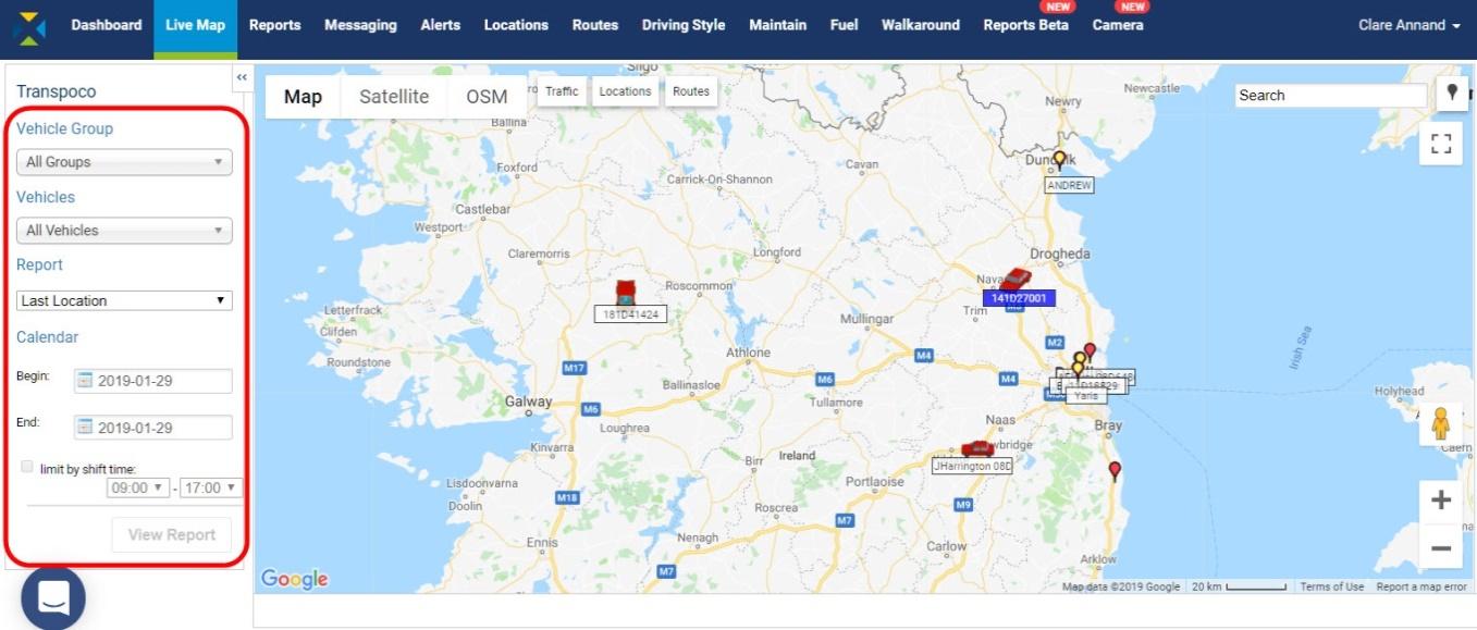
The drop-down menus in the Report Generator make it easy for you to select the criteria required for the report. You can choose:
- Vehicle group (could be type of vehicle, depot, department)
- Vehicles (one, some (e.g. team) or all)
- Name of report
- Dates from/to
- Shift times (if required)
- Additional criteria for some reports includes:
- name of Location or geofence for Location Report
- name of Route for Route Completion Report
- type of Alert for specific Exception Reports
- Driver groups and specified Drivers for Driver Activity Report
- Driver groups, specified Drivers and name of the Alert for Driver Alerts Summary
In addition, some reports allow for further narrowing of the results with the addition of the Duration calculator. You can run the reports for only those events over or under a specified time, for example Stops or Idling greater than the specified time.
Note: Depending on your fleet management requirements, some of the reports and features may not be available in your system.
- Creating a report
Unless otherwise stated for a report, they are all created in the following way:
- Select the Vehicle Group – leave as All Groups or select a group from the drop-down menu.
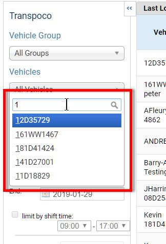
- Next select the Vehicles – leave as All Vehicles or select one from the drop-down menu. If the list is very long, start typing the Vehicle name/number in the search box and the list will shorten. For example, in the image below, typing 1 immediately shortens the list to only vehicle numbers beginning with 1.
- Next, select the type of report you wish to run from the drop-down list.
- Click on the Begin and End Calendars to select the date range for the report.
- If appropriate, check the Limit by Shift Time box and select the start and end times from the drop-down lists. The report will only display data between the time range you selected.
- Click on the View Report button. The report will populate and appear in place of the map. ‘Reports’ will be highlighted in the functionality (top) menu.
- Other statistical formats
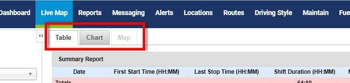
Some of the reports, where appropriate, include a chart view as well as the table view. This is a useful way to compare data, such as between vehicles, dates, time of day, etc.
Where appropriate, some reports include a map, such as showing where stops or idling have occurred. If not appropriate for the report, the Chart or Map view will be greyed out.
- Click on the Chart tab or Map tab, if available, at the top of the report.
- Exporting data
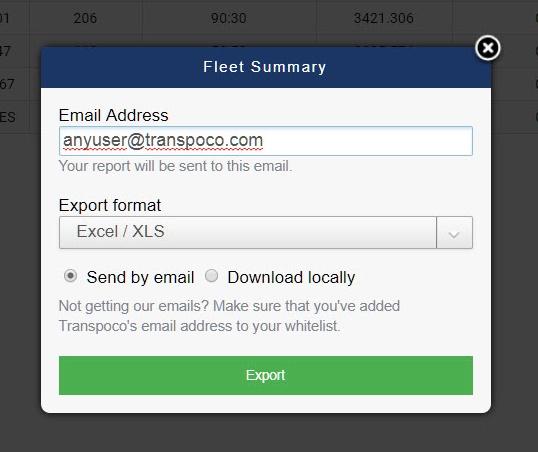
Historical data in SynX reports can be exported to spreadsheet programs, either emailed to recipients or downloaded locally.
- To export the data as .csv or .xls format, click on the Export icon above the far right column in the reports.
- Type in the recipient’s email address if sending the data, or chose from the list of addresses.
- Select the export format from the drop-down list – either CVS or EXCEL/XLS.
- Select whether to send the data by email or download as a file onto your system.
- Press the green Export button.
- Last Location Report
This report differs from the others as it is capturing real-time information so the dates cannot be changed.
- Ensure you are in Live Map view.
- Select the Vehicle Group and Vehicles.
- Select Last Location from the drop-down list of reports.
- Select Reports from the top menu and the real-time data will appear in a table.
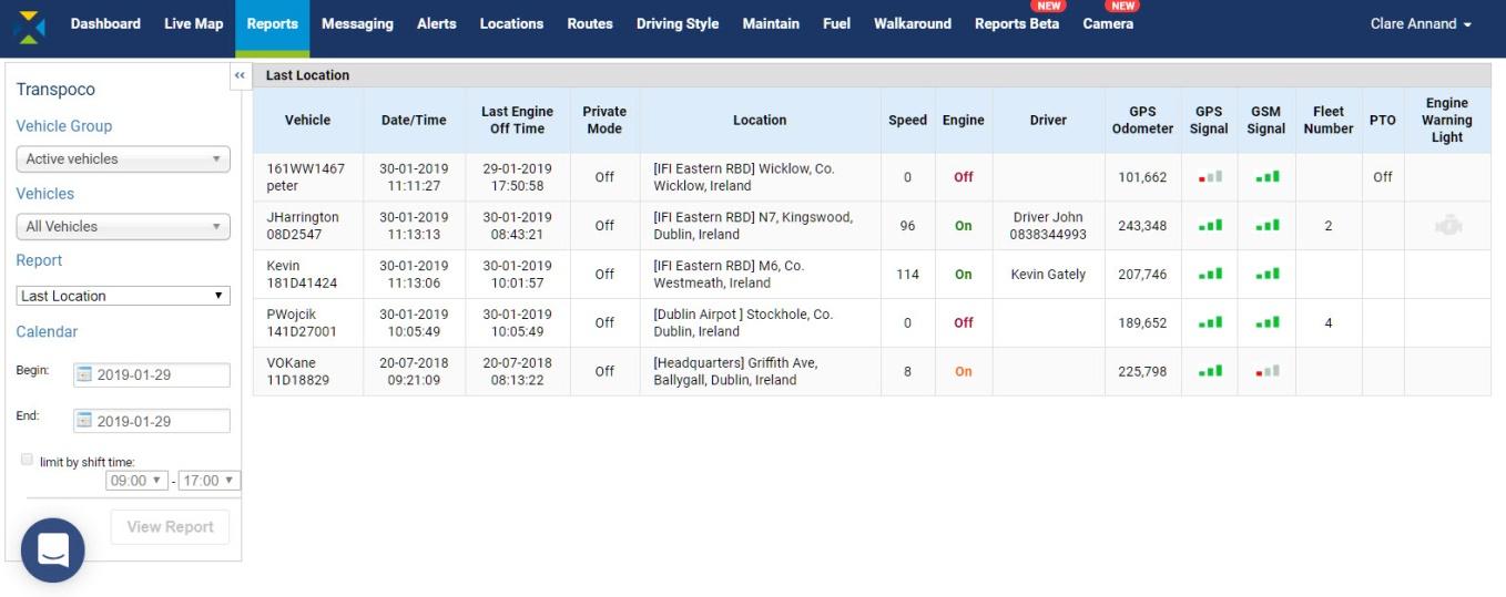
The standard information contained in this report is:
- Vehicle: Vehicle name/number
- Date/Time: Time of last update
- Last Engine Off Time: Time engine was last turned off
- Private Mode: Private mode enabled by driver, Yes/No
- Location: Location at last update
- Speed: Speed at last update
- Engine: Engine current status, On/Off
- Driver: Name of driver if assigned to a vehicle
- GPS Odometer: GPS-based mileage counter at last update
- GPS Signal: Indication of current GPS signal strength
- GSM Signal: Indication of current GSM signal strength
- Fleet Number: Number of the fleet (if assigned)
- PTO: PTO status if PTO is enabled
- Engine Warning Light If enabled in vehicle, icon turns orange if on
Note: The columns in the Last Location Report are customisable by user profile, e.g. removing PTO column if not applicable to the fleet.
- Fleet Summary Report
The Fleet Summary Report shows high-level activity information about all the vehicles in the whole fleet (or a selected vehicle group).
- Select the Vehicle Group and Vehicles.
- Select Fleet Summary from the drop-down list of reports.
- Choose whether to only show private use – select Yes to Private Mode Only or No to include all business and private use. Note: the default is No.
- Select the date range, and shift time, if required.
- Click on the View Report button.
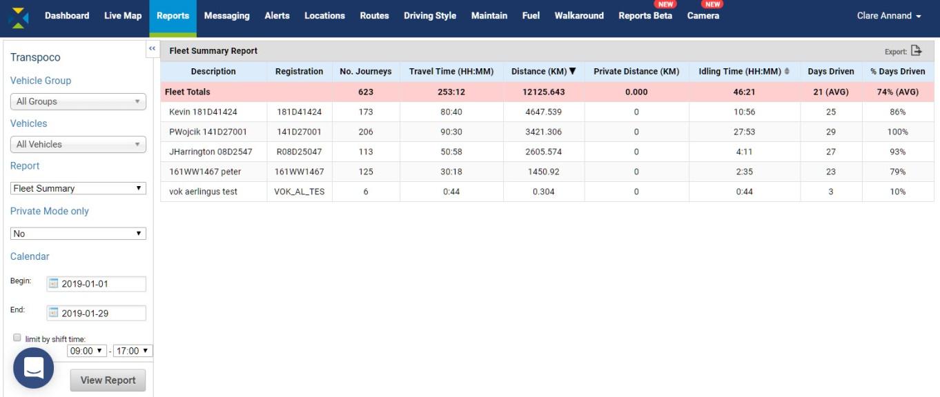
The standard information (can be customised) contained in this report covers the following for the selected period:
- Description: Vehicle description
- Registration: Vehicle number plate
- No. Journeys: Total number of separate journeys undertaken
- Travel Time: Total hours and minutes vehicle was moving
- Distance: Total distance (in km or miles) covered
- Private Distance: Total distance (in km or miles) covered for private use
- Idling Time: Total hours & minutes vehicle had ignition on but not moving
- Days Driven: Number of days the vehicle was driven out of the total period.
- % Days Driven: The number of days as a percentage of the total.
The totals for the fleet (or selected group of vehicles) are in the pink row.
The Distance and Idling Times can be sorted into ascending and descending order. The default is for the summary to be listed in descending distance order, so the higher use vehicles are at the top. This is because travelling and idling use fuel, and over- and under-utilised vehicles can be easily identified in the report.
- To sort the columns into a different order, click the small black arrow on the column heading.
- To export the data as .csv or .xls format, click on the Export icon above the far right column.
- Summary Report
Similar to the Fleet Summary Report, but the Summary Report can be filtered further to one or more vehicles, and shows start/stop time of the day’s activities and a route replay on the map.
- Select the Vehicle Group and Vehicles.
- Select Summary from the drop-down list of reports.
- Choose whether to only show private use – select Yes to Private Mode Only or No to include all business and private use. Note: the default is No.
- Select the date range, and shift time, if required.
- Click on the View Report button.
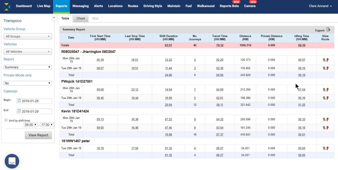
The totals for the fleet (or selected group of vehicles) are in the pink row.
The standard information (can be customised) contained in this report covers the following for each day during the selected period:
- Date: Date vehicle was driven
- First Start Time: The first time the engine was started that day in hours & minutes
- Last Stop Time: The last time the engine was turned off that day in hours & minutes
- Shift Duration: The time between the first engine on and the last engine off
- No. Journeys: Total number of separate journeys undertaken that day
- Travel Time: Total hours and minutes vehicle was moving
- Distance: Total distance (in km or miles) covered that day
- Private Distance: Total distance (in km or miles) covered for private use
- Idling Time: Total hours & minutes vehicle had ignition on but not moving
- View route: Mapped route of the journey between start time and last stop time
The No. Journeys is also a hyperlink to the Journey Report for that vehicle on that day. This report is covered in the next section.
- To export the data as .csv or .xls format, click on the Export icon above the far right column.
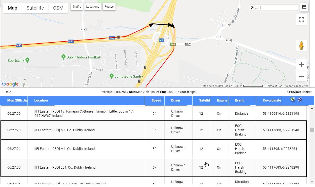
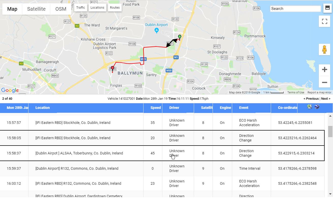
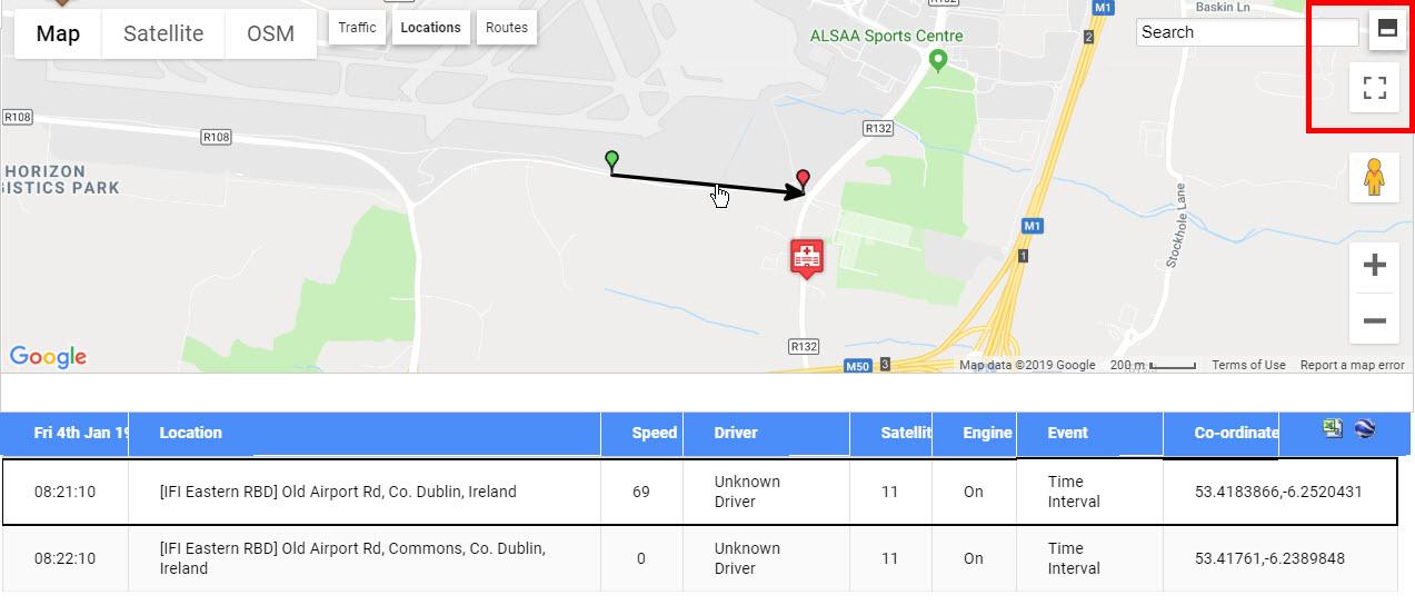
- View route
- To view on the map a replay of the journeys of any vehicle on any day, click the View Route icon at the end of that row.
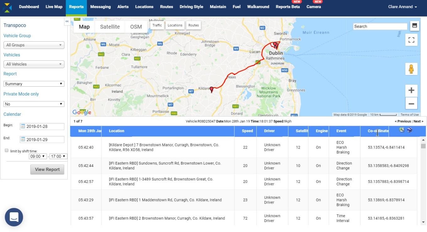
The journeys are drawn from start to finish mapping out the total driven that day. The first journey starts at the green pin and is displayed in red. The end location of the last journey is displayed with a red icon. Usually the end red pin is in the same place as the start green pin as vehicles return to the site at the end of the day.
The rows show the individual driving events and driving time intervals (usually every ~30 seconds) that sent data from the GPS unit to the software, such as driver activity including harsh braking.
The standard information contained in this table covers the following for each driving event and part of the journey:
- Date: Shows the date of the journeys
- Location: Where the driving event took place
- Speed: Snapshot of the speed when driving data was sent
- Driver: Assigned driver to vehicle
- Satellites: Number of satellites tracking the vehicle GPS
- Engine: Ignition on or off
- Event: Vehicle data updates on movement and time intervals
- Coordinates: Map coordinates of location
- Click on rows in the table to view the corresponding event on the journey as black arrows.
- Use the map controls to zoom into parts of the journey or view in Street View.
- By default, the map and table are split 50/50 on the screen. To show the map full screen, click on the Split Screen icon (top icon) in the top left-hand corner. The system will remember your choice.

- As the map will fill now the screen, scroll down to view the table rows.
- Click the icon again to return to 50/50 split screen.
- To view only the map in full screen, click on the Full Screen icon (bottom icon) in the top left-hand corner.
- To exit the full screen mode, click on the icon again or press the ESC key.
- To export this detailed data in .csv format, click on the Excel icon in the top right-hand corner of the table.
- To save the report to Google Earth in .kml format, click the Google Earth icon next to the Excel icon. Saved places can be imported into Google Earth on the device on which you saved them.
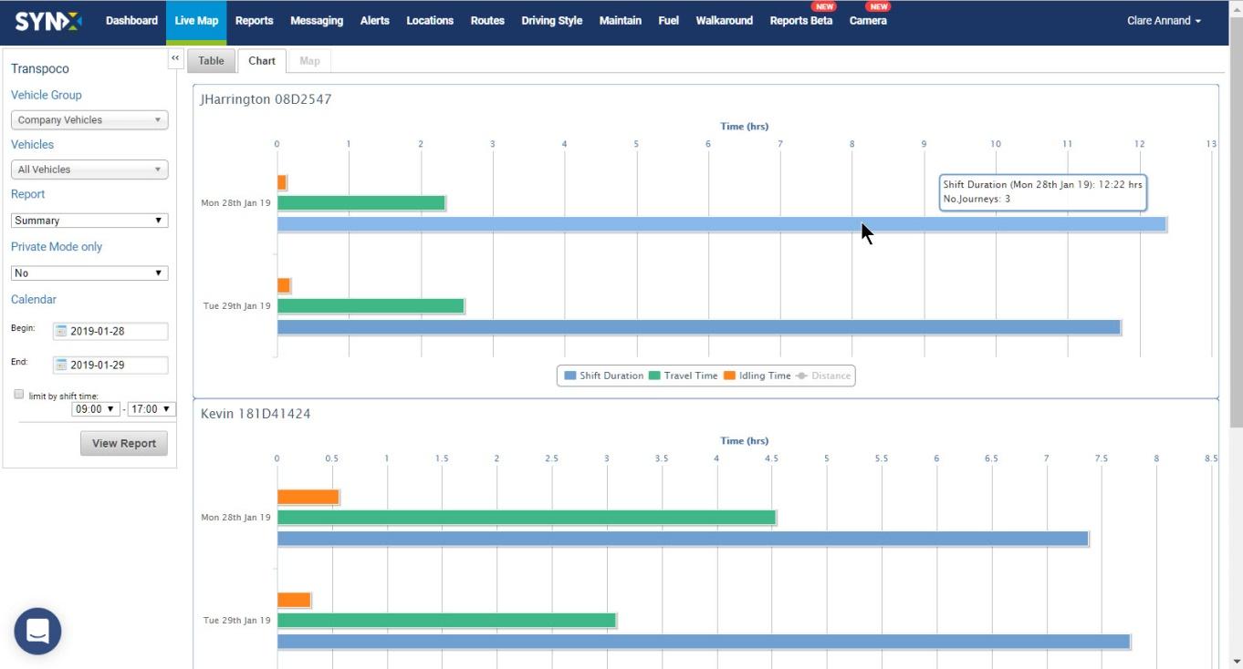
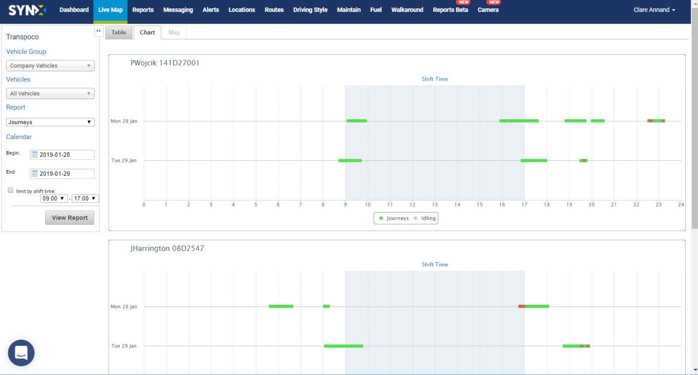
- Chart view
The Summary chart view graphs the Shift Duration, Travel Time, Idling Time and Distance per vehicle per day.
- Click on the Chart tab.
- Hover the cursor over the bars to see the information in a pop-up, such as date, duration of the shift and number of journeys in the shift.
- Journeys Report
The Journey Report show all journeys made by each vehicle/driver in a day. A journey is defined as engine turned on to engine turned off.
- Select the Vehicle Group and Vehicles.
- Select Journeys from the drop-down list of reports.
- Select the date range, and shift time, if required.
- Click on the View Report button.
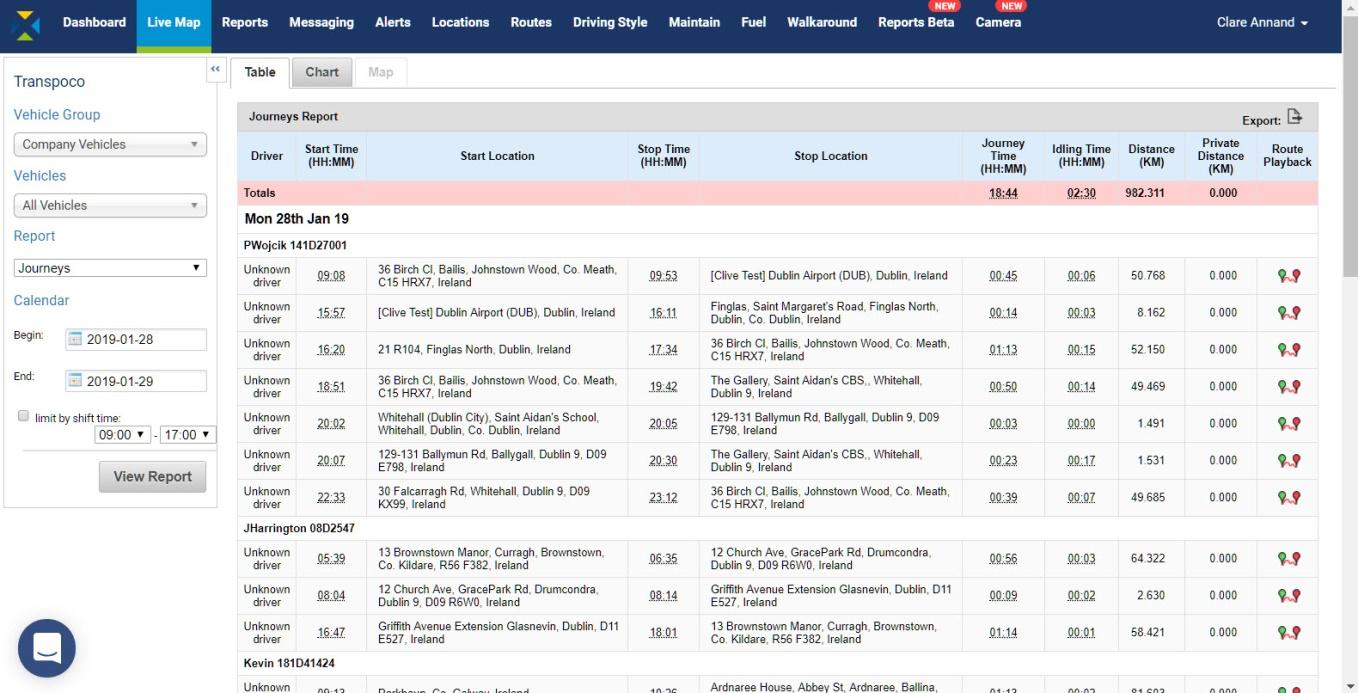
The totals for the fleet (or selected group of vehicles) are in the pink row.
The standard information (can be customised) contained in this report covers the following for each day during the selected period:
- Driver: Assigned driver to vehicle
- Start Time: The time the journey started (engine on)
- Start Location: Where the journey started
- Stop Time: The time the journey started (engine off)
- Stop Location: Where the journey ended
- Journey Time: Length of time in hours & minutes that the engine was on
- Idling Time: Length of time the engine was on but vehicle did not move
- Distance: Distance (in km or miles) of journey
- Private Distance: Total distance (in km or miles) covered for private use
- Route Playback: Mapped route of the journey between start time and stop time
- To export the data as .csv or .xls format, click on the Export icon above the far right column.
- View route
- To view on the map a replay of the journey of any vehicle on any day, click the Route Playback icon at the end of that row.
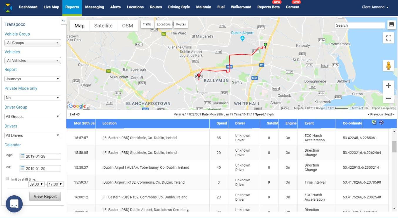
The journey is drawn from start (green pin) to finish (red pin) mapping out the total driven that day.
The rows show the individual driving events and driving time intervals (usually every ~30 seconds) that sent data from the GPS unit to the software, such as driver activity including harsh braking.
The standard information contained in this table covers the following for each driving event and part of the journey:
- Date: Shows the date of the journey
- Location: Where the driving event took place
- Speed: Snapshot of the speed when driving data was sent
- Driver: Assigned driver to vehicle
- Satellites: Number of satellites tracking the vehicle GPS
- Engine: Ignition on or off
- Event: Vehicle data updates on movement and time intervals
- Coordinates: Map coordinates of location
- Click on rows in the table to view the corresponding event on the journey as black arrows.
- Use the map controls to zoom into parts of the journey or view in Street View.
- By default, the map and table are split 50/50 on the screen. To show the map full screen, click on the Split Screen icon (top icon) in the top left-hand corner. The system will remember your choice.
- As the map will fill now the screen, scroll down to view the table rows.
- Click the icon again to return to 50/50 split screen.
- To view only the map in full screen, click on the Full Screen icon (bottom icon) in the top left-hand corner.
- To exit the full screen mode, click on the icon again or press the ESC key.
- To export this detailed data in .csv format, click on the Excel icon in the top right-hand corner of the table.
- To save the report to Google Earth in .kml format, click the Google Earth icon next to the Excel icon. Saved places can be imported into Google Earth on the device on which you saved them.
- Chart view
The Journey chart view graphs the Travel Time and Idling Time per vehicle per day.
- Click on the Chart tab.
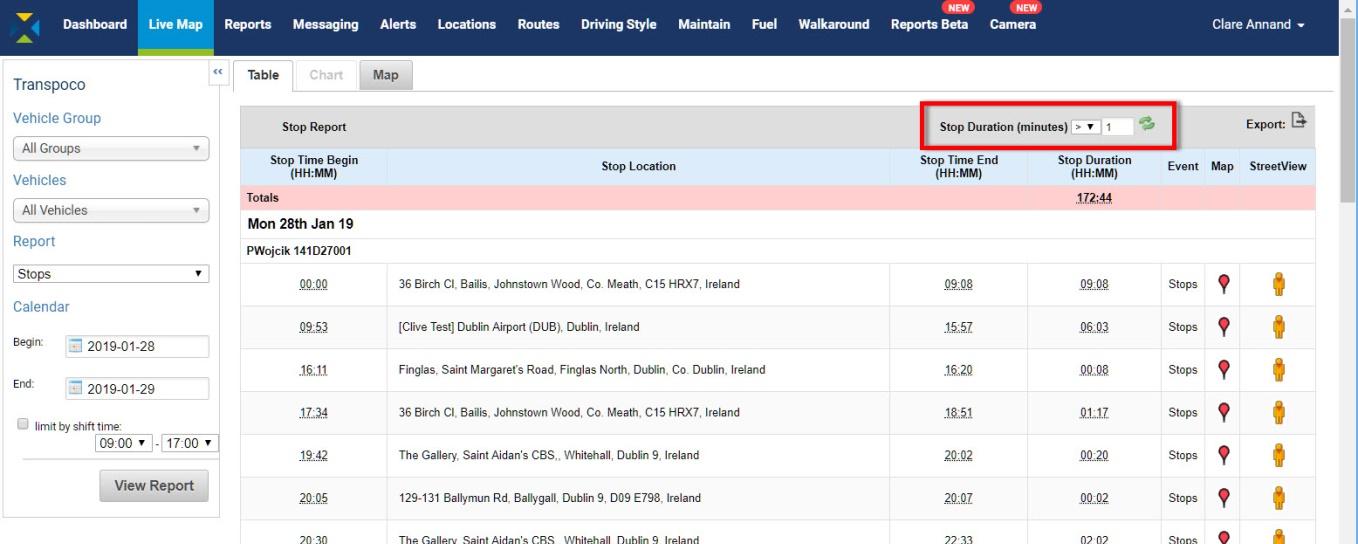
- Stops Report
A Stop is categorised by any time the vehicle’s engine is turned off; the stop ends when the ignition is started. A Stops Report shows the location and duration of every stop made.
- Select the Vehicle Group and Vehicles.
- Select Stops from the drop-down list of reports.
- Select the date range, and shift time, if required.
- Click on the View Report button.
The total stop duration for the fleet (or selected group of vehicles) is in the pink row.
The standard information (can be customised) contained in this report covers the following for each day during the selected period:
- Stop Time Begins: The time (in hours & minutes) the engine was turned off
- Stop Location: Where the engine was turned off
- Stop Time End: The time (in hours & minutes) the engine was turned on
- Stop Duration: Length of time (in hours & minutes) the engine was off
- Event: Engine off
- Map: View the location of the Stop on the map
- Street View: View the location of the Stop in Street View
In addition, the Stop Report can be filtered to only display stops greater or lesser than a certain length of time in minutes. The default is greater than 1 minute.
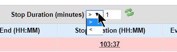
- Click on the down arrow and select either > (greater than) or < (less than).
- Type the number minutes in the text box.
- Click on the green refresh icon.
The table will be refreshed with the filtered data.
- To export the data as .csv or .xls format, click on the Export icon above the far right column.
- View all Stops on the map
- In Table view, click on the Map tab. The map will include all the stops specified in the Report Generator and Duration filter.
As with vehicles in the Last Location Map, Stops may be clustered if spread over a large area.
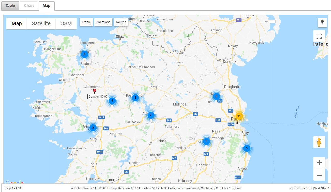
- Use the Google tools to zoom in to see the stop locations.

The active stop (usually the first stop) will have a bouncing red pin so it can be distinguished against the others.
- To scroll through the stops, click on Previous Stop or Next Stop.
- To see details of the stop (vehicle/driver, location, date, duration, and stop start and end times), hover the cursor over the red pin and the details will pop up.

- To view the map in full screen, click on the Full Screen icon (bottom icon) in the top left-hand corner.
- To exit the full screen mode, click on the icon again or press the ESC key.
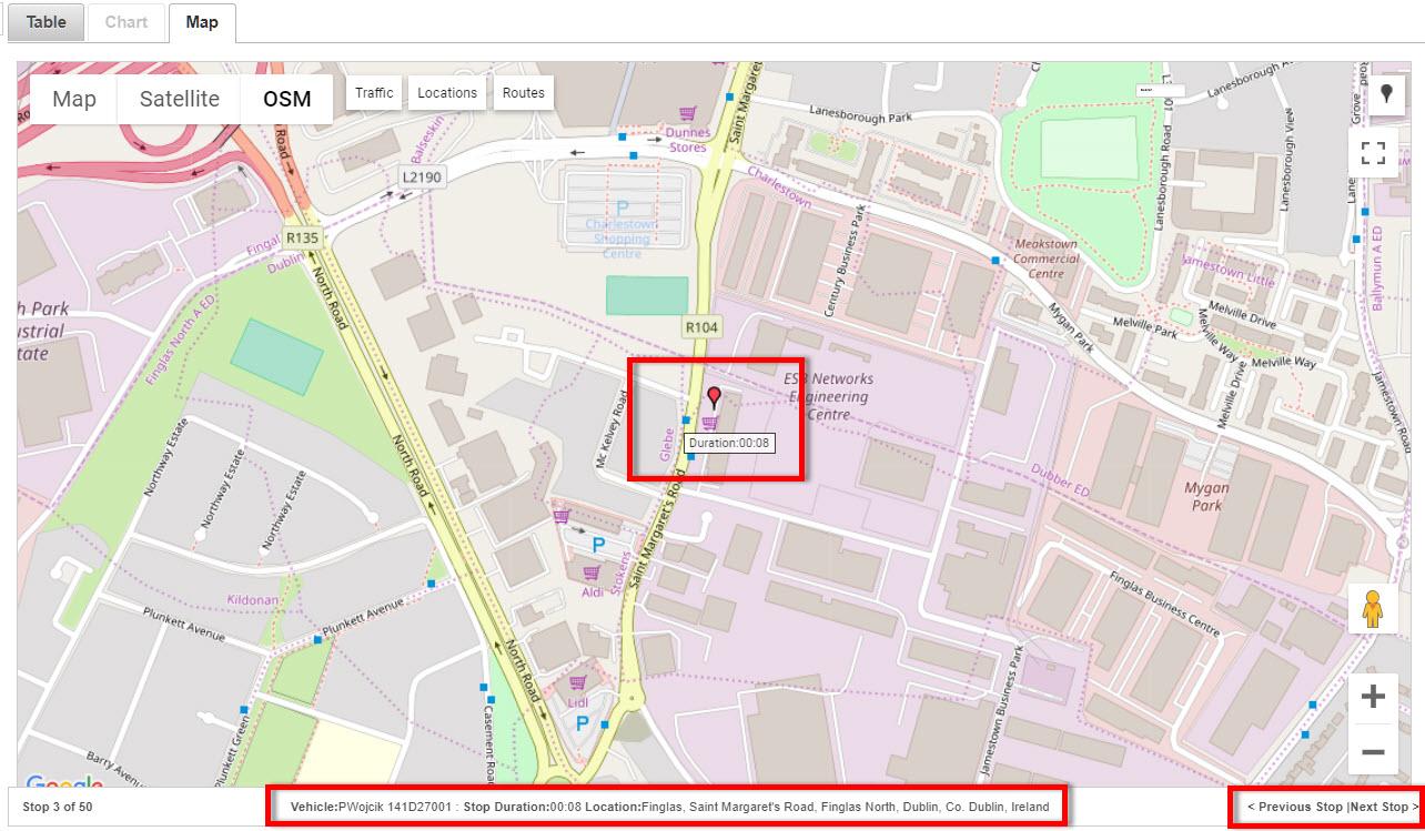
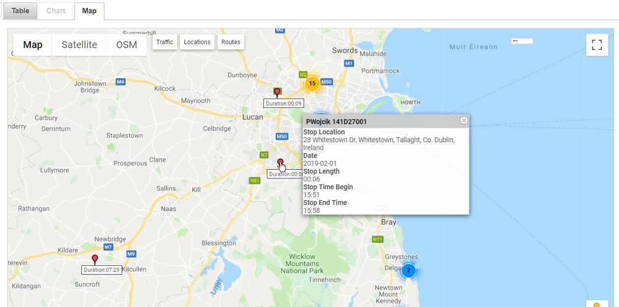
- View Stops individually on the map
- To view an individual stop location on the map, click the Map icon (red pin) at the end of that row. The red pin bounces up and down over the duration time, and the vehicle and location details are in the status bar.
Tip: Turning on the OSM layer can give more information about the stop location (in this case, the vehicle has stopped by shops).
- To scroll through the stops on the map, click on Previous Stop or Next Stop.
- To return to the table view, click on the Table tab.
- To view an individual stop location in Street View, click the Pegman at the end of the row.
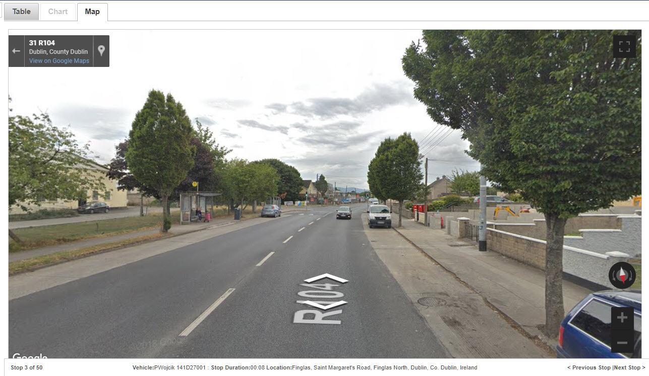
- To scroll through the stops in Street View, click on Previous Stop or Next Stop.
- To return to the table view, click on the Table tab.
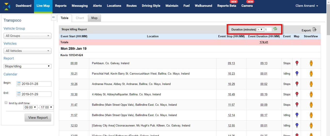
- Idling Report
Idling is classified as ignition on but the vehicle not moving (speed of vehicle is zero). An Idling Report shows the location and duration of all idling.
- Select the Vehicle Group and Vehicles.
- Select Idling from the drop-down list of reports.
- Select the date range, and shift time, if required.
- Click on the View Report button.
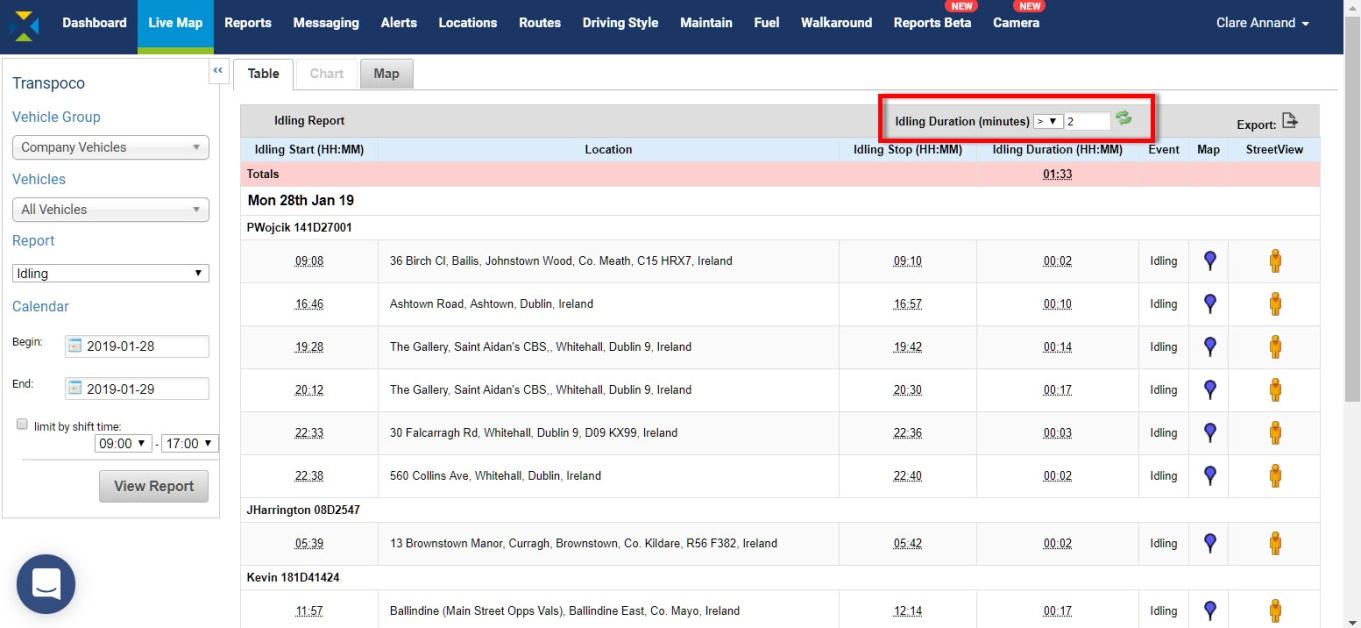
The idling duration for the fleet (or selected group of vehicles) is in the pink row.
The standard information (can be customised) contained in this report covers the following for each day during the selected period:
- Idling Start: The time (in hours & minutes) the vehicle stopped with engine on
- Location: Where the idling event occurred
- Idling Stop: The time (in hours & minutes) the vehicle starting moving
- Idling Duration: Length of time (in hours & minutes) the vehicle stopped with engine on
- Event: Engine on, speed zero
- Map: View the location of the idling on the map
- Street View: View the location of the idling in Street View
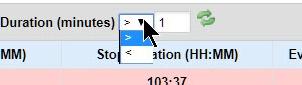
- As with the Stops Report, to filter the idling results to less or more than a number of minutes, click on the down arrow and select either > (greater than) or < (less than). The default is greater than 1 minute.

- Type the number minutes in the text box.
- Click on the green refresh icon.
The table will be refreshed with the filtered data.
- To export the data as .csv or .xls format, click on the Export icon above the far right column.
- View all idling events on the map
- In Table view, click on the Map tab. The map will include all the idling specified in the Report Generator and Duration filter.
As with vehicles in the Last Location Map, idling events may be clustered if spread over a large area.
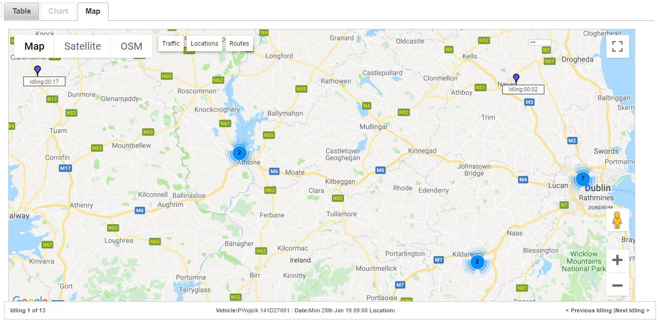
- Use the Google tools to zoom in to see the idling locations.
The active idling event (usually the first) will have a bouncing blue pin so it can be distinguished against the others.
- To scroll through the idling events, click on Previous Idling or Next Idling.
- To see details of the idling (vehicle/driver, location, idling start and end times, and duration), hover the cursor over the blue pin and the details will pop up.
- To view the map in full screen, click on the Full Screen icon in the top left-hand corner.
- To exit the full screen mode, click on the icon again or press the ESC key.
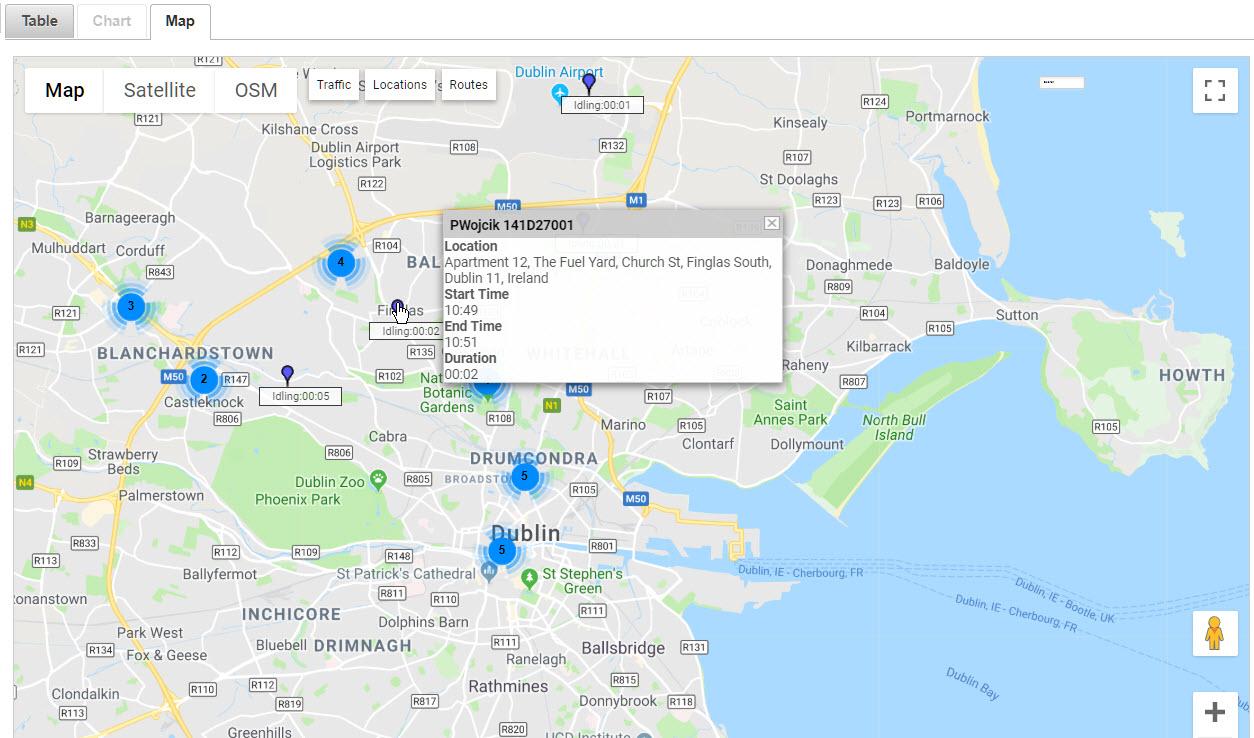
- View idling individually on the map
- To view an individual idling location on the map, click the Map icon (blue pin) at the end of that row. The blue pin bounces up and down over the duration time, and the vehicle and location details are in the status bar.
Tip: Turning on the OSM layer can give more information about the idling location (in this case, the vehicle has been idling by shops for 10 minutes).
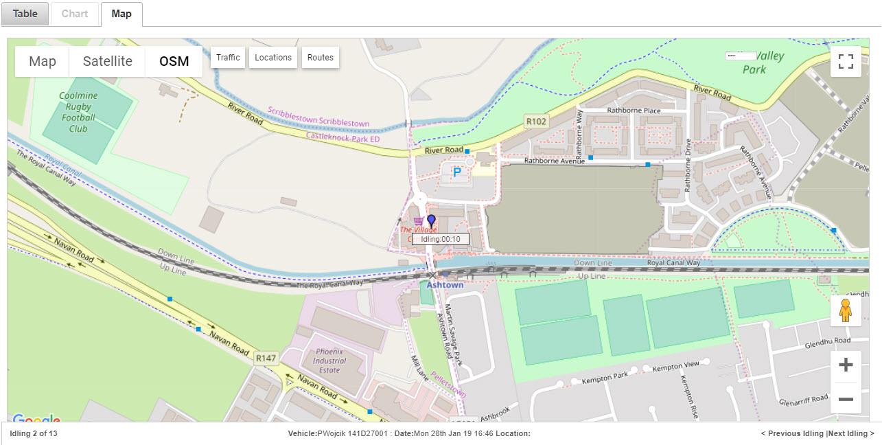
- To scroll through the idling events on the map, click on Previous Idling or Next Idling.
- To return to the table view, click on the Table tab.
- To view an individual idling location in Street View, click the Pegman at the end of the row.
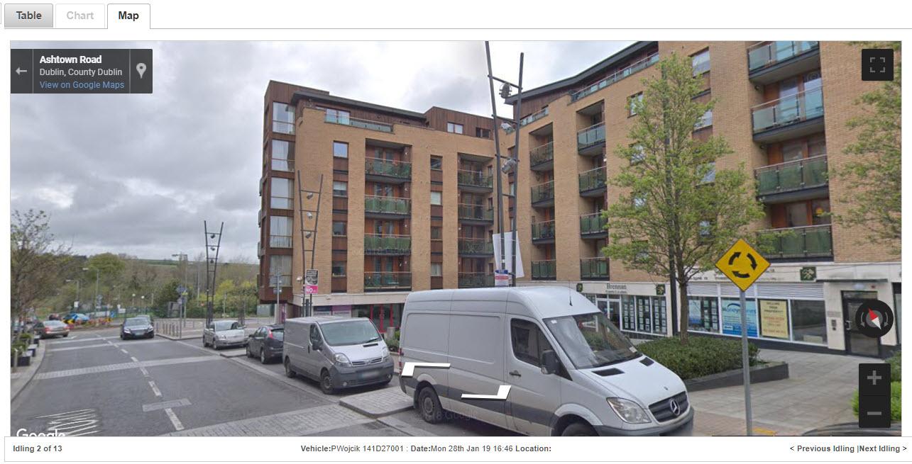
- To scroll through the idling events in Street View, click on Previous Idling or Next Idling.
- To return to the table view, click on the Table tab.
- Stops/Idling Report
The Stop/Idling Report combines the information from the Stops Report and Idling Report.
- Select the Vehicle Group and Vehicles.
- Select Stops/Idling from the drop-down list of reports.
- Select the date range, and shift time, if required.
- Click on the View Report button.
The total stops/idling duration for the fleet (or selected group of vehicles) is in the pink row.
The standard information (can be customised) contained in this report covers the following for each day during the selected period:
- Event Start: The time (in hours & minutes) the vehicle stopped or began idling
- Location: Where the stop or idling event occurred
- Event Stop: The time (in hours & minutes) the vehicle starting moving
- Event Duration: Length of time (in hours & minutes) the vehicle stopped (engine off & on)
- Event: Engine off; or Engine on, speed zero
- Map: View the location of the stop or idling on the map
- Street View: View the location of the stop or idling in Street View
As in the Stops Report and Idling Report, red pins indicate stops and blue pins indicate idling.
- As with the Stops Report and Idling Report, to filter the stops/idling results to less or more than a number of minutes, click on the down arrow and select either > (greater than) or < (less than). The default is greater than 1 minute.
- Type the number minutes in the text box.
- Click on the green refresh icon.
The table will be refreshed with the filtered data.
- To export the data as .csv or .xls format, click on the Export icon above the far right column.
- View all stops/idling events on the map
- In Table view, click on the Map tab. The map will include all the stops and idling specified in the Report Generator and Duration filter.
As with vehicles in the Last Location Map, stops and idling events may be clustered if spread over a large area.
- Use the Google tools to zoom in to see the stops and idling locations.
The active stop or idling event (usually the first event) will have a bouncing red or blue pin so it can be distinguished against the other events. Depending on the type of the first event (stop or idling) or one selected on the map, the Previous/Next will scroll through either stops or idling.
- To scroll through the stop/idling events, click on Previous Stops/Idling or Next Stops/Idling.
- To see details of the stop/idling (vehicle/driver, location, start and end times, and duration), hover the cursor over the red/blue pin and the details will pop up.

- To view the map in full screen, click on the Full Screen icon in the top left-hand corner.
- To exit the full screen mode, click on the icon again or press the ESC key.
- View a stop/idling individually on the map
- To view an individual stop/idling location on the map, click the Map icon (red pin for stop or blue pin for idling) at the end of that row. The pin bounces up and down over the duration time, and the vehicle and location details are in the status bar.
- To scroll through the stop/idling events on the map, click on Previous Stop/Idling or Next Stop/Idling.
- To return to the table view, click on the Table tab.
- To view an individual stop/idling location in Street View, click the Pegman at the end of the row.
- To scroll through the stop/idling events in Street View, click on Previous Stop/Idling or Next Stop/Idling.
- To return to the table view, click on the Table tab.
- Locations Report
The Locations Report allows for analysis of any given location or area (geofence) stored in the Locations Database; for instance, what activity occurred at a site or within an area for the last week.
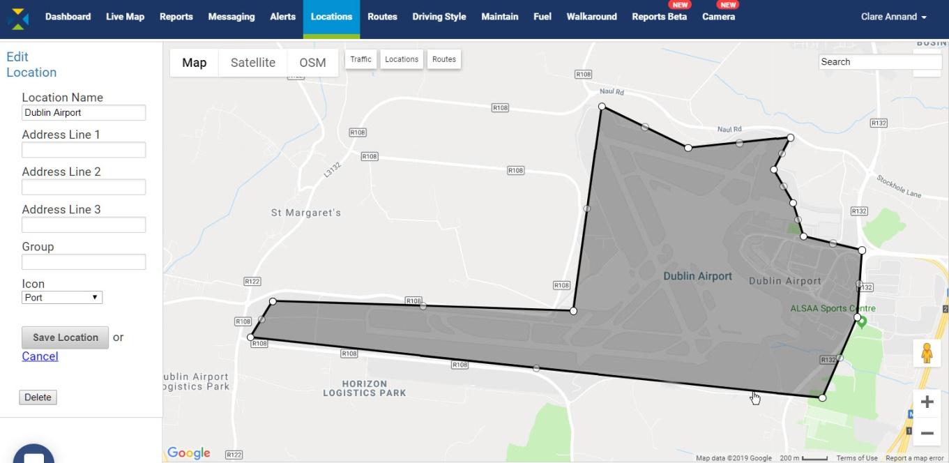
For instructions on how to create locations and geofences to store in the Locations Database, see Section XX.
- Select the Vehicle Group and Vehicles.
- Select Locations from the drop-down list of reports.
- Select the location or geofence from the drop-down list of locations.
- Select the date range, and shift time, if required.
- Click on the View Report button.
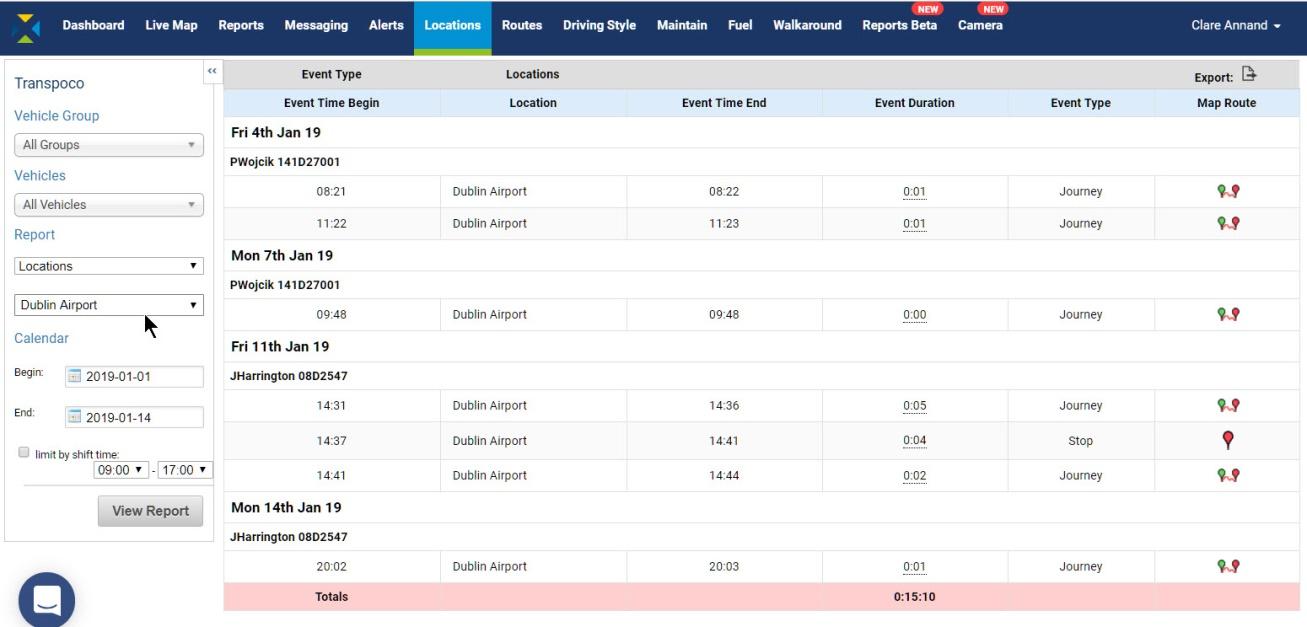
The total time spent at the location or within the geofence for the fleet (or selected group of vehicles) is in the pink row.
The standard information (can be customised) contained in this report covers the following for each day during the selected period:
- Event Time Begin: The time the vehicle entered the boundary of the location
- Location: Where the event happened
- Event Time End: The time the vehicle left the boundary of the location
- Event Duration: Length of time (in hours & minutes) vehicle was within location
- Event Type: Vehicle passing through on journey or stopped within location
- Map Route: Route of the journey or exact location of stop shown on map
- To export the data as .csv or .xls format, click on the Export icon above the far right column.
- View route or stop
- To view on the map a stop or a replay of the journey of a vehicle within the location, click the Map Route icon or red pin Stop icon at the end of that row.
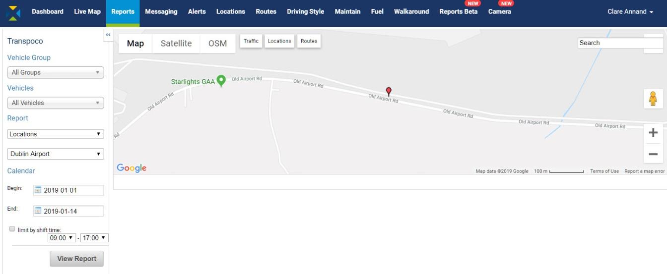
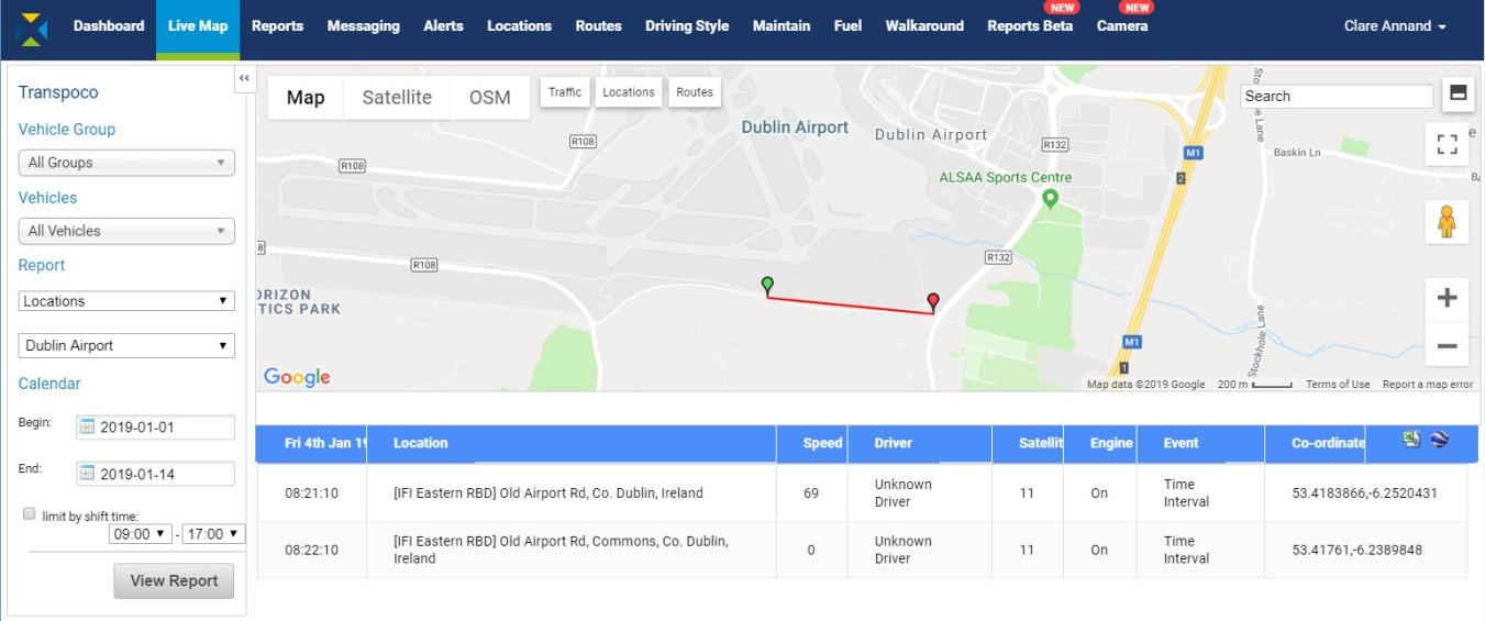
The route travelled inside the location boundary (as defined in SynX) is shown as starting at the green pin and ending at the red pin, which also therefore shows the direction the vehicle was travelling in.
If we look at the boundary created for the location, we can see that the route and the stop both just touch on it. For instructions on how to create locations, see Section XX.
- By default, the map and table are split 50/50 on the screen. To show the map full screen, click on the Split Screen icon (top icon) in the top left-hand corner. The system will remember your choice.
- As the map will fill now the screen, scroll down to view the table rows.
- Click the icon again to return to 50/50 split screen.
- To view only the map in full screen, click on the Full Screen icon (bottom icon) in the top left-hand corner.
- To exit the full screen mode, click on the icon again or press the ESC key.
- Hover the cursor over the route and the red line will become a black arrow to show the direction of travel, and the corresponding event will be highlighted in the rows.
- To return to the table view from the map view, either re-click on Reports in the navigation menu at the top or click on the View Report button.
- To export this detailed data in .csv format, click on the Excel icon in the top right-hand corner of the table.
- To save the report to Google Earth in .kml format, click the Google Earth icon next to the Excel icon. Saved places can be imported into Google Earth on the device on which you saved them.
- Route Completion Summary Report
For vehicles or drivers working on set routes, the Route Completion Summary Report shows at a glance the percentage of work that has been completed (or not).
Note: For how to add set routes to SynX, see Section XX.
- Select the Vehicle Group and Vehicles.
- Select Route Completion Summary from the drop-down list of reports.
- Select the Route from the drop-down list of pre-defined routes.
- Select the date range, and shift time, if required.
- Click on the View Report button.
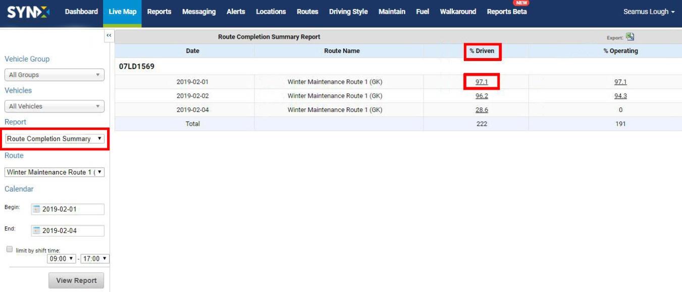
The totals for the fleet (or selected group of vehicles) are in the pale purple row.
The standard information contained in this report covers the following for the selected period:
- Date: The date the routes were driven during the selected period
- Route Name: The name of the pre-set route
- % Driven: The percentage of the route completed by the vehicle
- % Operating: The percentage of the route the PTO equipment was engaged
- To export the data as .csv or .xls format, click on the Export icon above the far right column.
A breakdown of the route can be seen by clicking on the number in the % Driven column or the % Operating column, and this will open the Route Completion Report.
- Route Completion Report
The Route Completion Report shows the breakdown of a pre-set route and whether each part of the route has been covered by the vehicle and if the PTO equipment was operating.
- To open the Route Completion Report, click on the number in the % Driven column or the % Operating column for a route in the Route Completion Summary Route.
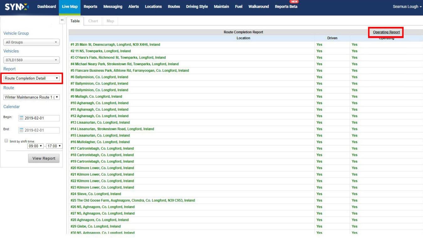
Each route is broken up into a number of checkpoints (as many as required to cover the route adequately). At each checkpoint you can see if the vehicle is driving through the checkpoint and also if the output equipment is engaged. If the answer is no to either of those, the text will be in red.
The standard information contained in this report covers the following for the selected period:
- Location: The checkpoint on the route
- Driven: Has the vehicle passed the checkpoint?
- Operating: Was PTO equipment operating as the vehicle passed the checkpoint?
- The Operating Report can be directly accessed from the Route Completion Report by clicking on the link in the top right-hand corner.
- Operating Report
For vehicles with output connections activated, the Operating Report shows a breakdown of actual operating times, mileage and map views.
There are two ways to access the Operating Report:
- Click on the link for the Operating Report in the Route Completion Report.
Or
- Within the Report Generator, select the Vehicle Group and Vehicle.
- Select Operating Activity from the drop-down list of reports.
- Select the Auxiliary Vehicle from the drop-down list.
- Select the date range, and shift time, if required.
- Click on the View Report button.
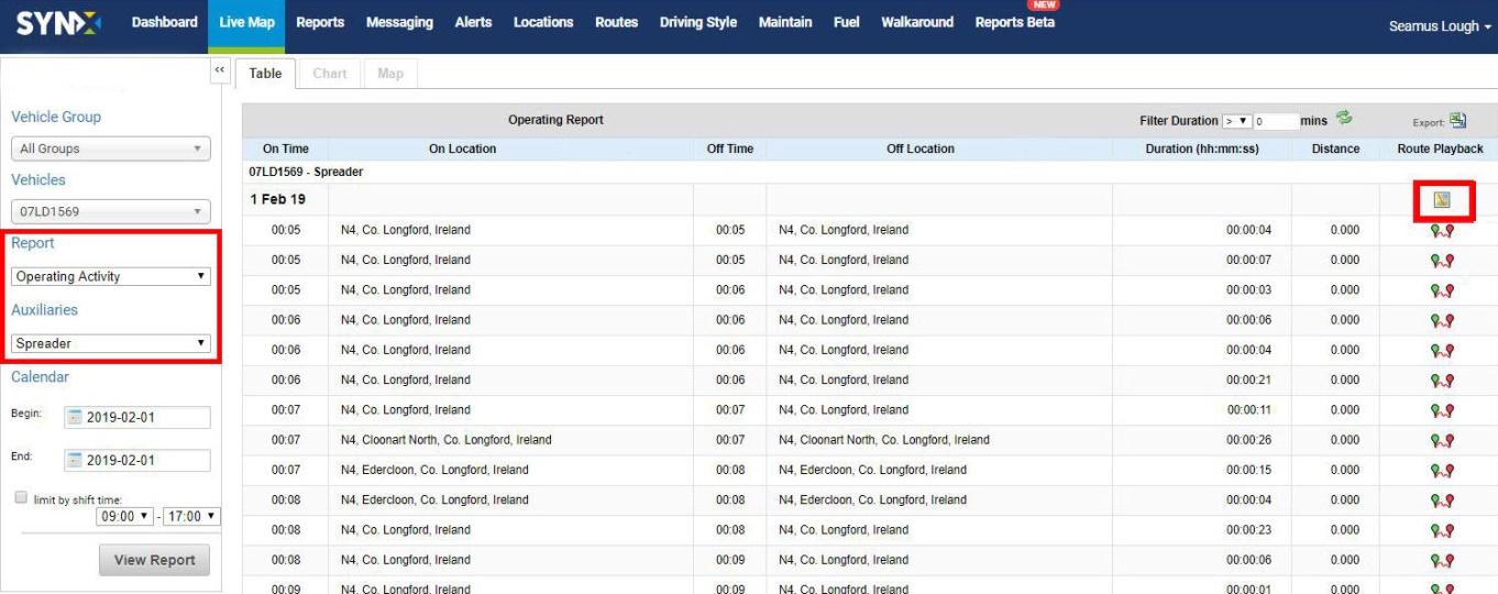
As with some other reports, the Operating Report can be filtered to only display durations greater or lesser than a certain length of time in minutes. The default is greater than 0 minutes.

- Click on the down arrow and select either > (greater than) or < (less than).
- Type the number minutes in the text box.
- Click on the green refresh icon.
The table will be refreshed with the filtered data.
- To export the data as .csv or .xls format, click on the Export icon above the far right column.
- View route on the map
- Click on the Route Playback icon at the end of a row to see the checkpoint on the map.
- Click on the Map icon above the Route Playback column to see the whole route on the map.
The rows show the individual driving events and driving time intervals (usually every ~30 seconds) that sent data from the GPS unit to the software.
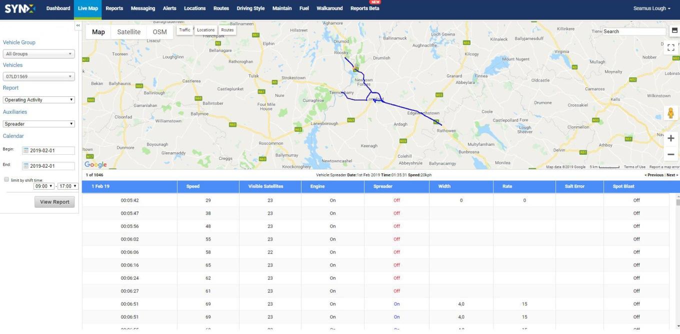
The standard information (can be customised) contained in this table covers the following for each checkpoint on the route (note: the information depends on the auxiliary vehicle; this example shows a salt spreader):
- Time: Time the vehicle passed the checkpoint
- Speed: Snapshot of the speed when passing the checkpoint
- Visible Satellites: Number of satellites tracking the vehicle GPS
- Engine: Ignition on or off
- Spreader: PTO equipment engaged or not
- Width: Width of salt spread in metres
- Rate: Spread rate in grams per metre
- Salt Error PTO malfunction
- Spot Blast: Function on or off
- Click on rows in the table to view the corresponding checkpoint on the route.
- Scroll through the checkpoints by clicking on Previous/Next between the map and the table.
- Use the map controls to zoom into parts of the journey or view in Street View.
- By default, the map and table are split 50/50 on the screen. To show the map full screen, click on the Split Screen icon (top icon) in the top left-hand corner. The system will remember your choice.

- As the map will fill now the screen, scroll down to view the table rows.
- Click the icon again to return to 50/50 split screen.
- To view only the map in full screen, click on the Full Screen icon (bottom icon) in the top left-hand corner.
- To exit the full screen mode, click on the icon again or press the ESC key.
- Operating Summary Report
The Operating Summary Report gives an overview of PTO operating data for each vehicle on each day in the selected period.
- Select the Vehicle Group and Vehicle.
- Select Operating Summary from the drop-down list of reports.
- Select the date range, and shift time, if required.
- Click on the View Report button.
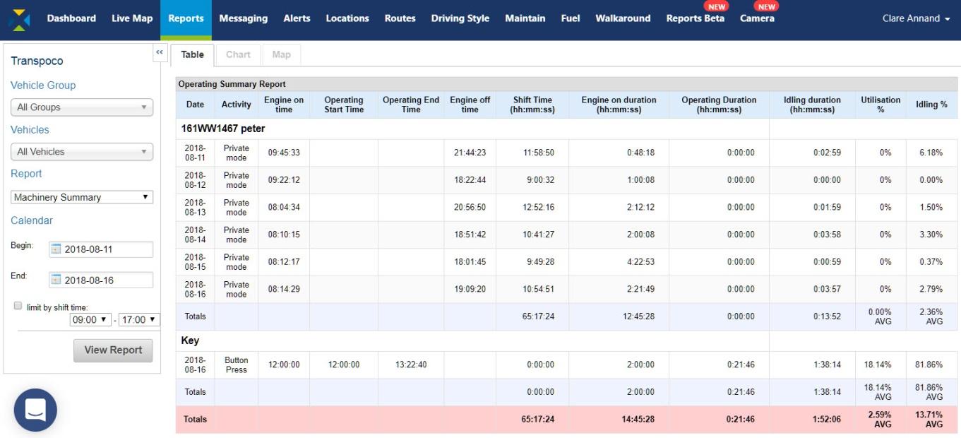
The totals for the fleet (or selected group of vehicles) are in the pink row.
The standard information (can be customised) contained in this report covers the following for each day during the selected period:
- Date: Date vehicle/PTO operated
- Activity: What took place on that date
- Engine on Time: Time the engine was turned on
- Operating Start Time: Time the PTO equipment was turned on
- Operating End Time: Time the PTO equipment was turned off
- Engine off Time: Time the engine was turned off
- Shift Time: Length of time (in hours, mins & secs) of driver’s shift
- Engine on Duration: Length of time (in hours, mins & secs) engine was turned on
- Operating Duration: Length of time (in hours, mins & secs) PTO was operating
- Idling Duration: Length of time (in hours, mins & secs) engine on & speed zero
- Utilisation % Percentage of operating time against shift time
- Idling % Percentage of idling time against shift time
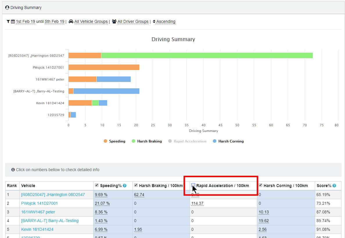
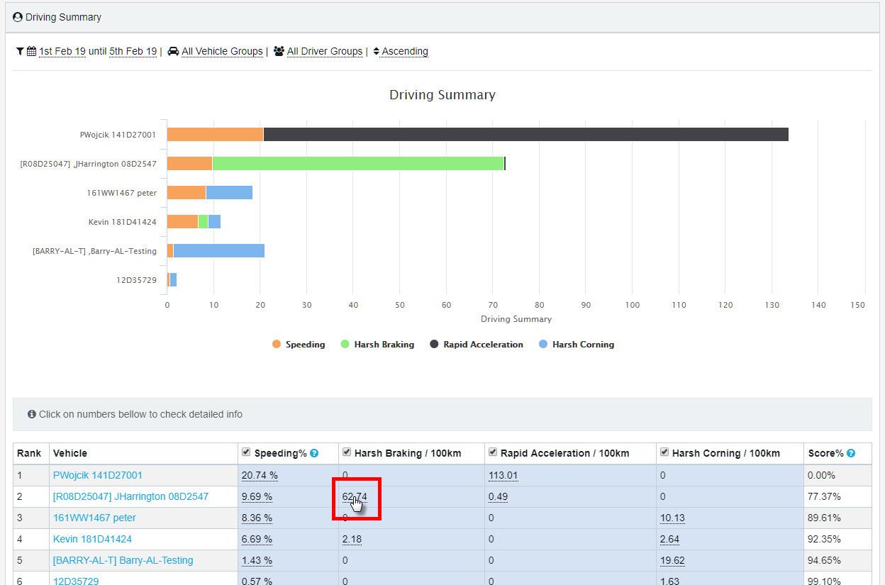
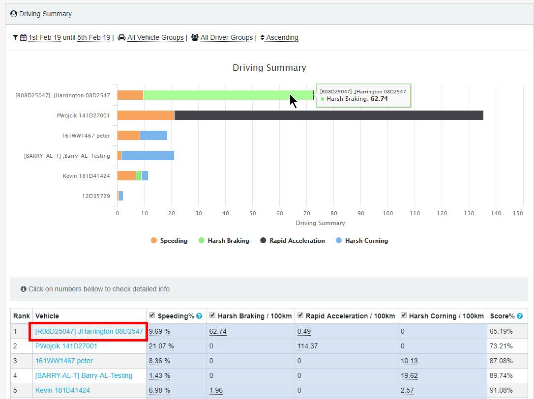
- Driving Summary Report
The Driving Summary Report displays a graph and statistics to analyse how each vehicle is being driven. It includes measurements of speeding, harsh braking, rapid acceleration and harsh cornering.
This report is part of SynX Perform, our fuel management software combining the GPS features of SynX Move with an advanced interface to analyse driver behaviour and fuel consumption in order to reduce costs, improve efficiency and, above all, improve driver safety.
- Click on Driving Style in the top menu. It will open to the default screen of Driving Summary.
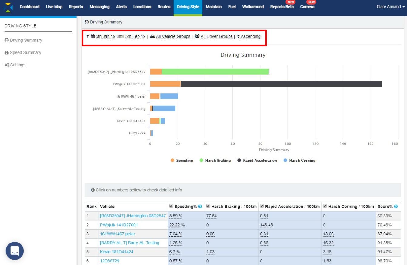
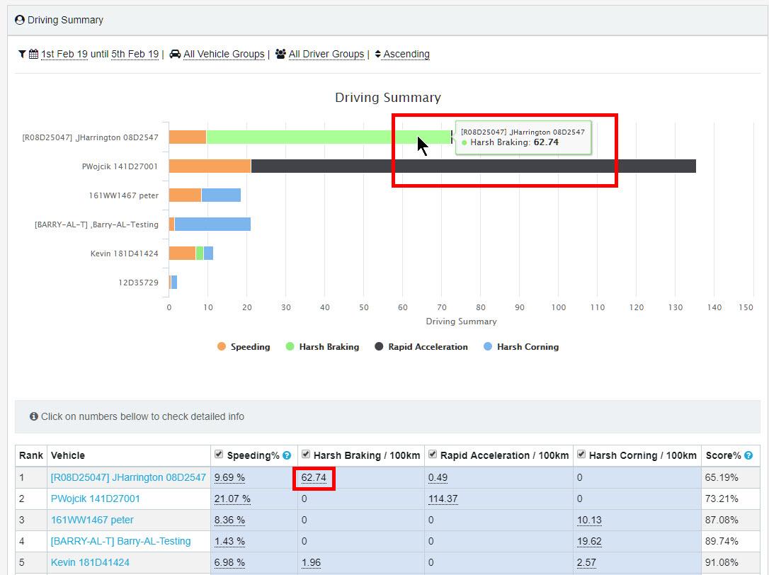
The information contained in this report covers the following for driving behaviour during the selected period:
- Rank: Ranking of vehicles/drivers based on Score %
- Vehicle: Vehicle or driver
- Speeding %: Percentage of events of speeding over the speed limit
- Harsh Braking: Events per 100km
- Rapid Acceleration: Events per 100km
- Harsh Cornering: Events per 100km
- Score %: Calculated from driving events & their weightings (see Settings)
To filter the results:
- Click anywhere on the filter options above the chart.
- Click on the first date to change the start of the required period.
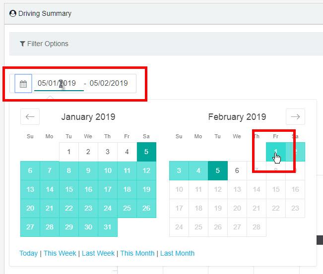
- Click on the required date and the calendar will close.
- Click on the second date to set the end of the required period.
- Click on the required date and the calendar will close.
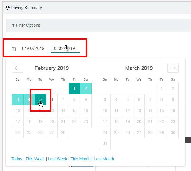
- Alternatively, you can click on one of the set periods at the bottom of the calendar pop-up. This will automatically populate the date range.
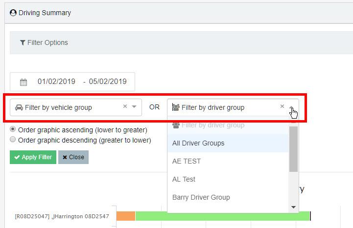
- To filter by group, either select a Vehicle Group or a Driver Group by clicking on the respective down arrow and select the group from the drop-down list.
The drivers can also be ranked from ‘best’ to ‘worst’ or ‘worst’ to ‘best’. To define who is a good/bad driver we have found the best method is to rank drivers on the number of bad driving events they generate per 100 km (Note: this can be changed to miles if preferred).
- Choose whether to order the results in ascending or descending order (default is ascending).
- If you wish to remove the group from the filter so all vehicles or drivers will be included, click on the small x next to the drop-down arrow.
- Click on the green Apply Filter button. To cancel all the changes, click the Close button. The filter box will close.
- The numbers in the table are reflected in the chart – hover the cursor over the bars to see the details.
Each type of driving event can be turned on or off in the report.
- To hide a driving event type(s) from the chart, click on the relevant event type(s) in the chart legend.
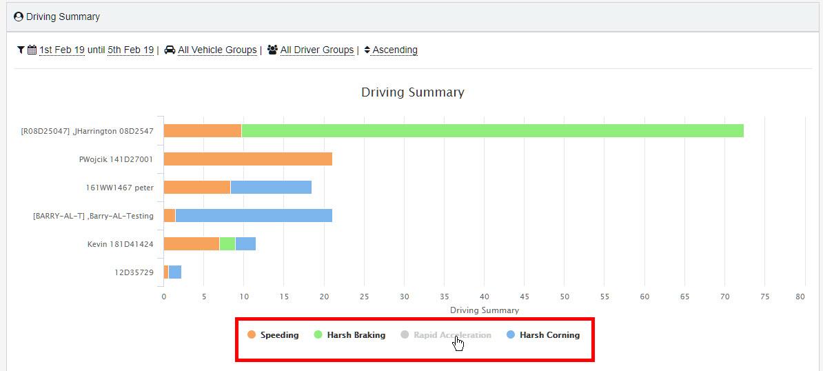
- To turn off a driving event type(s) in the table, uncheck the box next to the event type(s) in the heading of the table. This will automatically hide the event type in the chart.
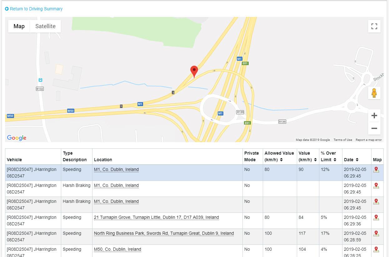
- View a vehicle’s speeding events
- To see details of each occurrence of speeding and its location on the map, click on the speeding number in the table; for example, clicking on 9.69% (see screen above) will show all speeding occurrences for JHarrington.
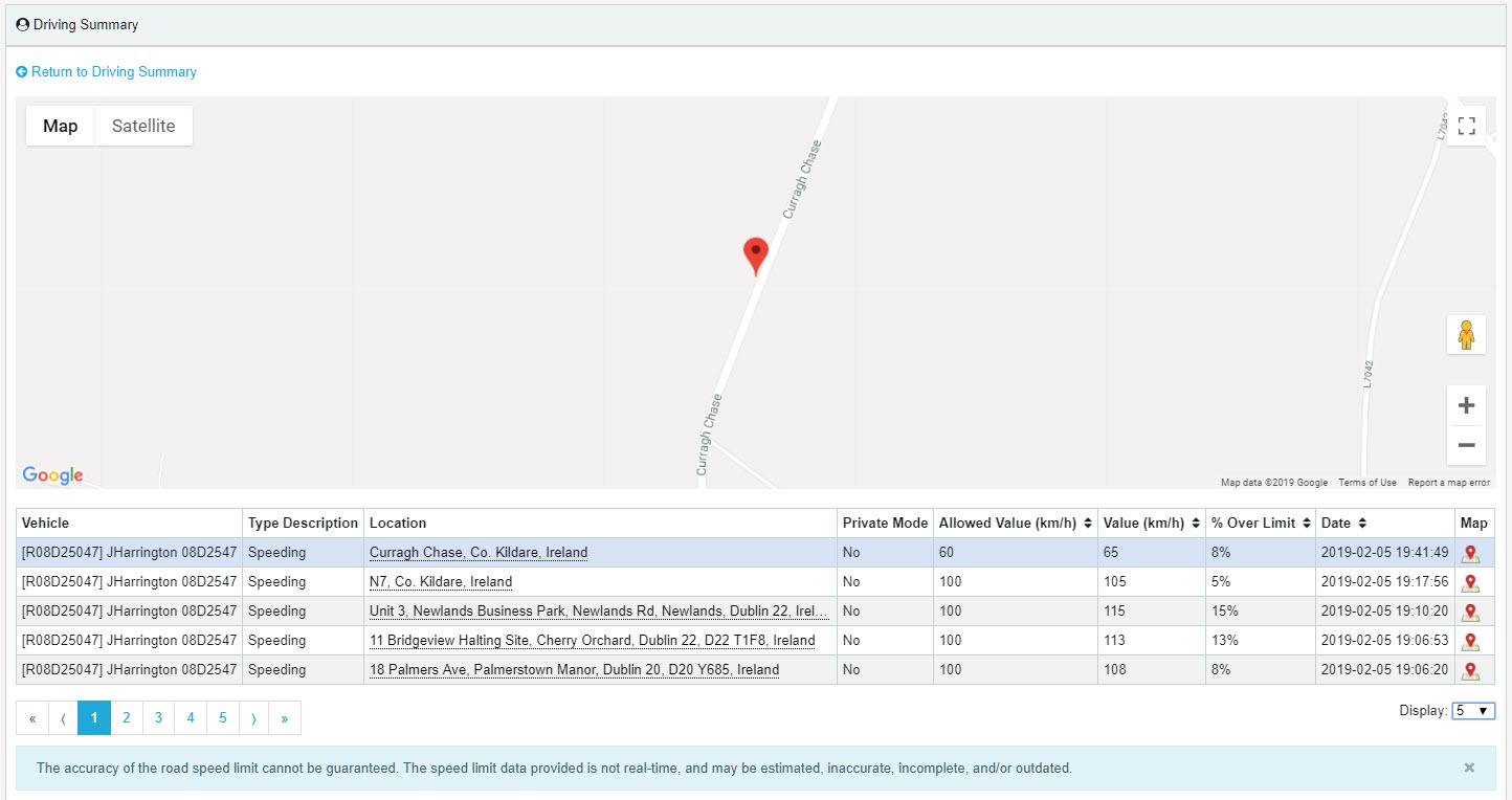
The map shows a bouncing red pin which denotes the location of the first event in the table.
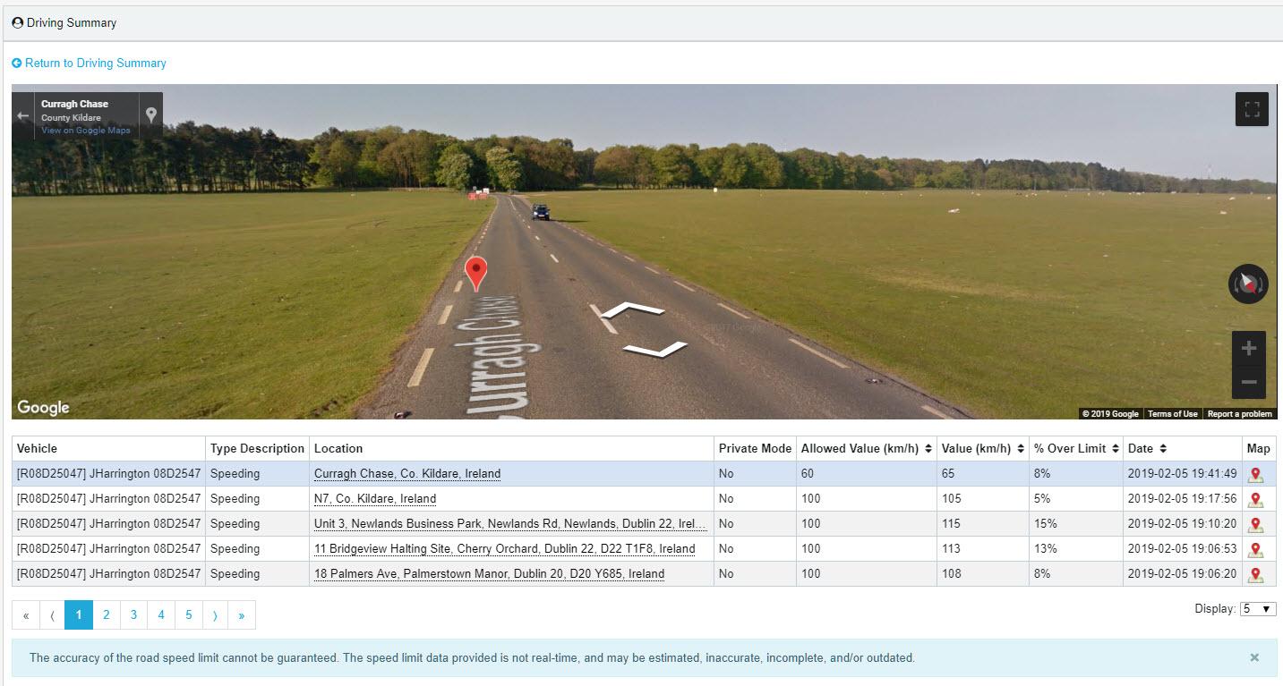
- To see other locations, either click on the address or the map icon at the end of the row.
- Use the Google map controls to zoom into the map or Street View if required.
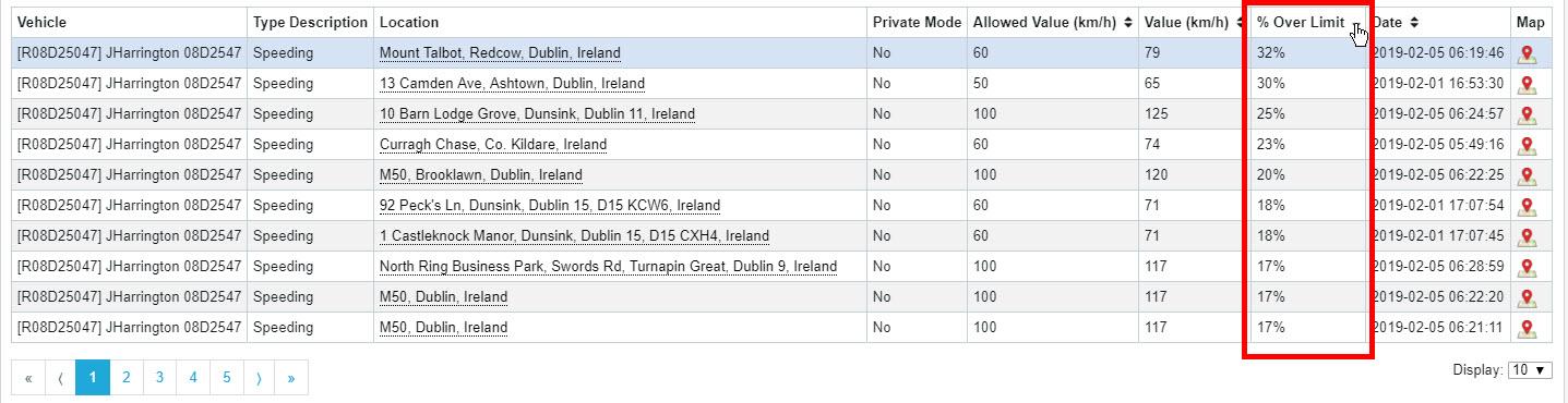
The information covers the following for each speeding event during the selected period:
- Vehicle: Vehicle/driver
- Type Description: Speeding
- Location: Address of speeding event
- Private Mode: Reads Yes only if private mode has been activated by the driver
- Allowed Value: Speed limit of road in km/h (or mph in UK)
- Value: Actual speed recorded in km/h (or mph in UK)
- % Over Limit: Percentage recorded speed is over speed limit of road
- Date: Date & time stamp of speeding event by GPS tracker
- Map: Click to view speeding event on map
The columns with black up/down arrows in the headers can be sorted into ascending or descending order.
- Click the arrow once to sort into descending order (largest value first); click again to re-sort into ascending order (smallest value first).
- To return to the main report, click on the Return to Driving Summary link above the map.
- View a vehicle’s harsh braking, rapid acceleration and harsh cornering events
Note: These driving events are all similar in terms of the table information, so the following details cover harsh braking only but can apply to any of them.
- To see details of each harsh braking occurrence for a vehicle and its location on the map, click on the corresponding number in the table, for example 62.74 for JHarrington in the following image.
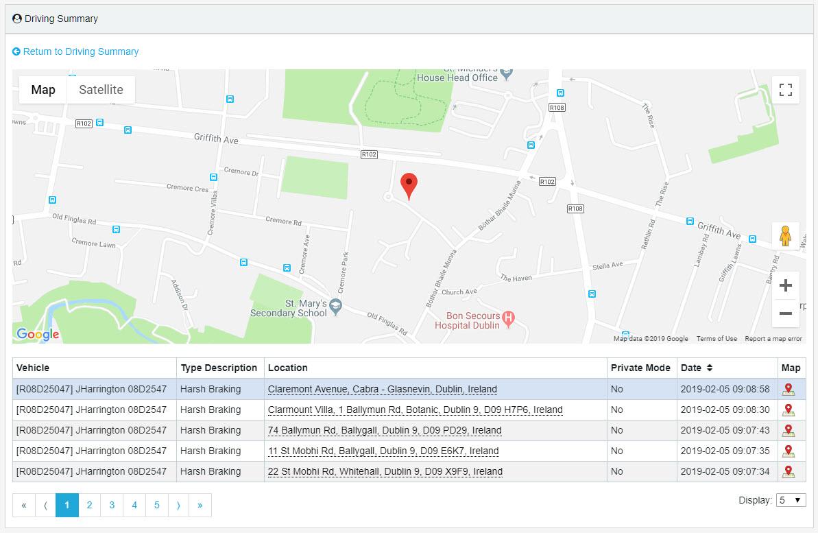
The map shows a bouncing red pin which denotes the location of the first event.
- To see other locations, either click on the address or the map icon at the end of the row.
- Use the Google map controls to zoom into the map or Street View if required.
The information covers the following for each driving event during the selected period:
- Vehicle: Vehicle/driver
- Type Description: Type of driving event, e.g. harsh braking
- Location: Address of driving event
- Private Mode: Reads Yes only if private mode has been activated by the driver
- Date: Date & time stamp of driving event by GPS tracker
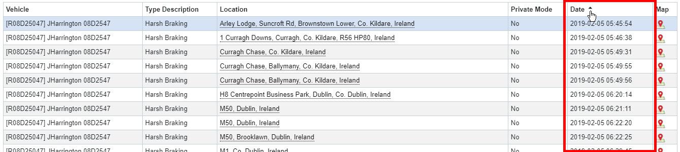
- Map: Click to view driving event on map
The date can be sorted into ascending or descending order.
- Click the arrow once to sort into descending date/time order (latest time first); click again to re-sort into ascending order (earliest time first).
- To return to the main report, click on the Return to Driving Summary link above the map.
- View all of a vehicle’s driving events
- To see details of each occurrence of all driving event types and their location on the map, click on the vehicle in the table; for example, clicking on JHarrington will show all driving events for that vehicle/driver.
The map shows a bouncing red pin to denote the location of the first event in the table.
- To see other locations, either click on the address or the map icon at the end of the row.
- Use the Google map controls to zoom into the map or Street View if required.
The information covers the following for each speeding event during the selected period:
- Vehicle: Vehicle/driver
- Type Description: Type of driving event
- Location: Address of speeding event
- Private Mode: Reads Yes only if private mode has been activated by the driver
- Allowed Value: Speed limit of road in km/h (or mph in UK)
- Value: Actual speed recorded in km/h (or mph in UK)
- % Over Limit: Percentage recorded speed is over speed limit of road
- Date: Date & time stamp of driving event by GPS tracker
- Map: Click to view driving event on map
The columns with black up/down arrows in the headers can be sorted into ascending or descending order. The default is descending date order.
- Click the arrow once to sort into descending value order; click again to re-sort into ascending order.

- To return to the main Summary report, click on the Return to Driving Summary link above the map.
- Driving Summary Settings
In Settings, you can choose the driving events to include and assign weightings to them, depending on the importance you place on them.
- In the Driving Style menu on the left-hand side, click on Settings.
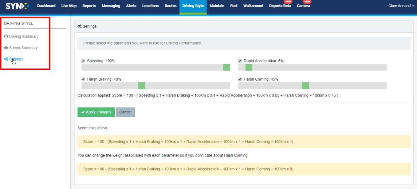
- Uncheck parameters (driving events) if you do not want to include them in the overall driving performance; default is for all to be checked.
- Change a weighting by clicking on the green square and sliding it to the required position; the percentage figure will change accordingly.
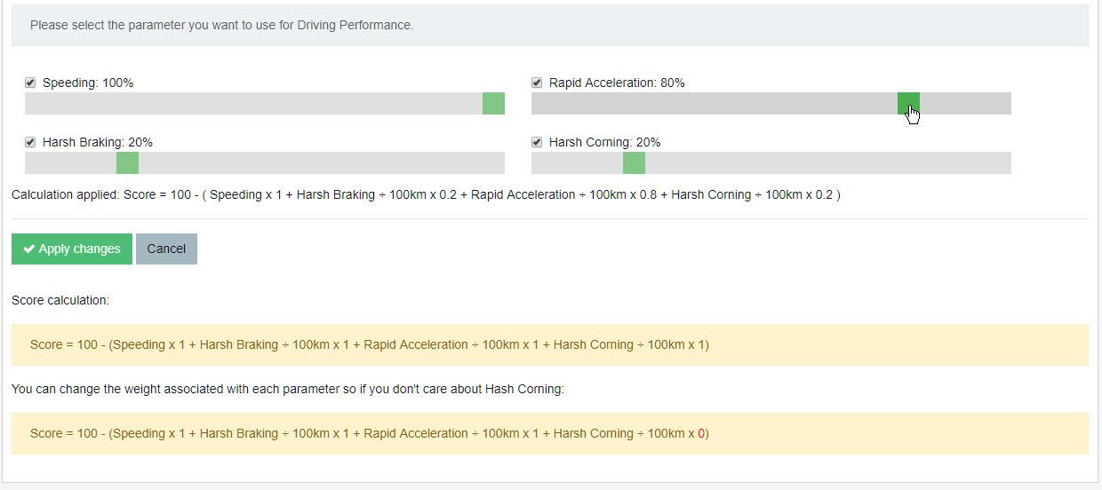
- Click on the Apply Changes button or click Cancel if you wish to discard your changes.
- Return to the Driving Summary Report by clicking on Driving Summary in the Driving Style menu on the left-hand side.
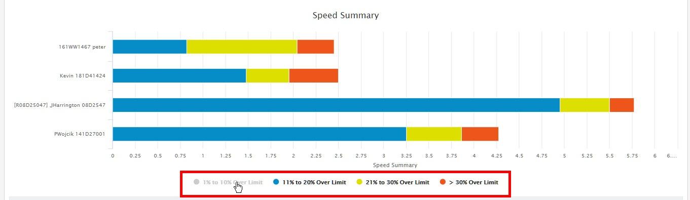
- Speed Summary Report
The Speed Summary Report is populated from alerts set to trigger when the vehicle exceeds the set speed limit for the road. (Note: Alerts are covered in Section XX.) This report drills down deeper into the speeding value in the Driving Summary Report by separating it into percentage ranges over the limit.
As with the Driving Summary Report, the Speed Summary Report is part of SynX Perform, our fuel management software combining the GPS features of SynX Move with an advanced interface to analyse driver behaviour and fuel consumption in order to reduce costs, improve efficiency and, above all, improve driver safety.
- Click on Driving Style in the top menu. It will open to the default screen of the Driving Summary Report.
- Click on Speed Summary in the Driving Style menu on the left-hand side.
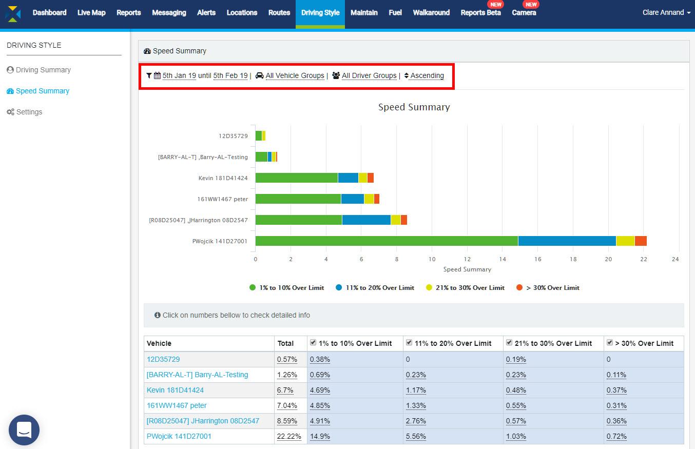
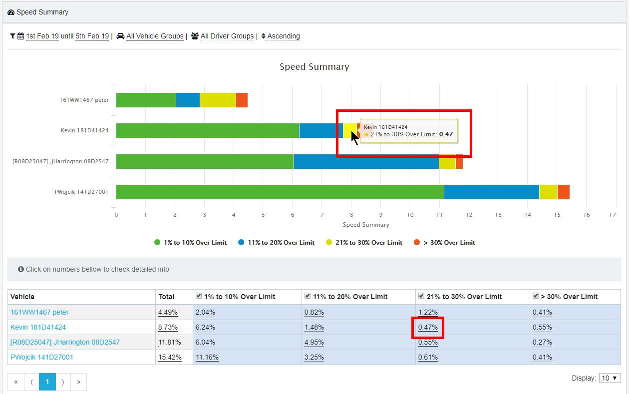
The information contained in this report covers the following for speeding events during the selected period:
- Vehicle: Vehicle or driver
- Total: Total % of speeding events over road speed limit
- 1-10% Over Limit: Percentage of speeding events 1-10% over speed limit
- 11-20% Over Limit: Percentage of speeding events 11-20% over speed limit
- 21-30% Over Limit: Percentage of speeding events 21- 30% over speed limit
- > 30% Over Limit: Percentage of speeding events more than 30% over speed limit
To filter the results:
- Click anywhere on the filter options above the chart.
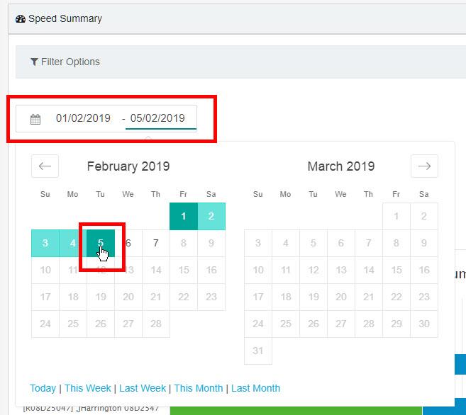
- Click on the first date to change the start of the required period.
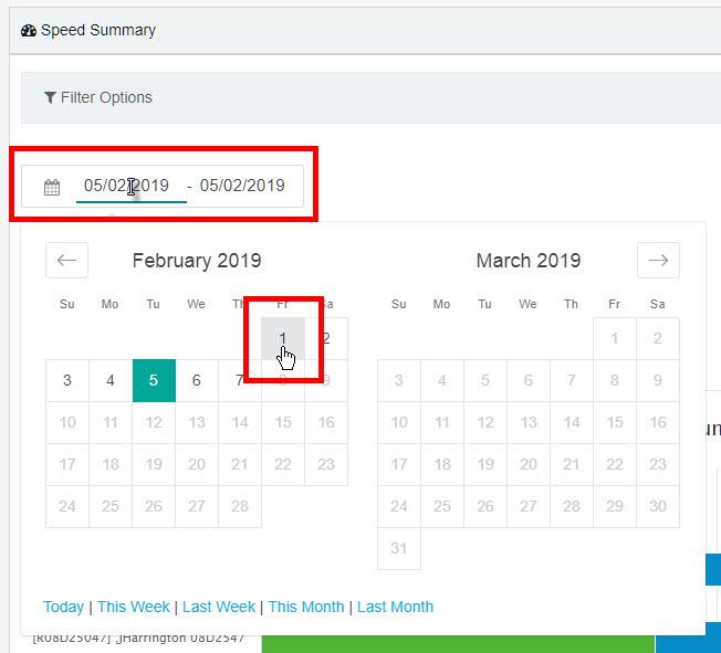
- Click on the required date and the calendar will close.
- Click on the second date to set the end of the required period.
- Click on the required date and the calendar will close.
- Alternatively, you can click on one of the set periods at the bottom of the calendar pop-up. This will automatically populate the date range.
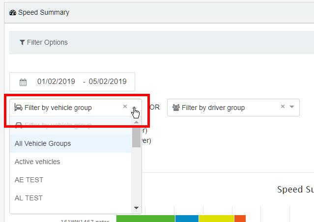
- To filter by group, either select a Vehicle Group or a Driver Group by clicking on the respective down arrow and select the group from the drop-down list.
The drivers can also be ranked from ‘best’ to ‘worst’ or ‘worst’ to ‘best’. To define who is a good/bad driver we have found the best method is to rank drivers on the total percentage of speeding above the speed limit they generate (Note: can be changed to miles if preferred).
- Choose whether to order the results in ascending or descending order (default is ascending).
- If you wish to remove the group from the filter so all vehicles or drivers will be included, click on the small x next to the drop-down arrow.
- Click on the green Apply Filter button. To cancel all the changes, click the Close button. The filter box will close.
- The numbers in the table are reflected in the chart – hover the cursor over the bars to see the details.
Each speeding range can be turned on or off in the report.
- To hide a speeding range(s) from the chart, click on the relevant range(s) in the chart legend.
- To turn off a speeding range(s) in the table, uncheck the box next to the range(s) in the heading of the table. This will automatically hide the speeding range in the chart.
- View one speeding range for a vehicle
- To see details of each occurrence of a speeding range and their locations on the map, click on the number in the table; for example, clicking on 1.48% (see screen above) will show all Kevin’s speeding occurrences of 21% to 30% Over Limit.
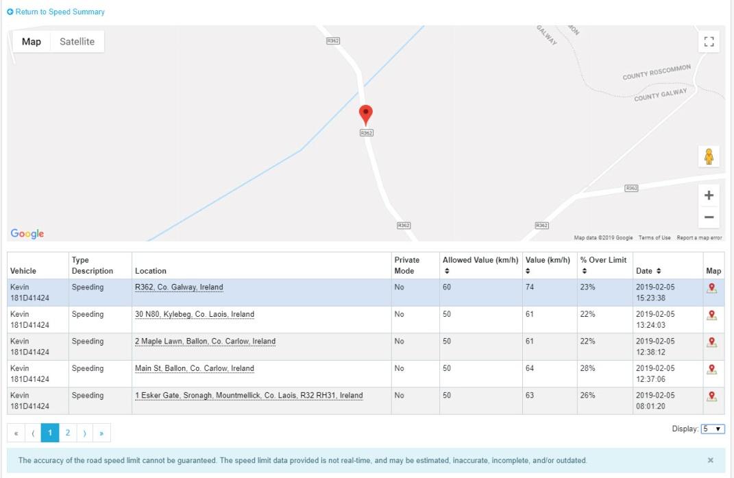
The map shows a bouncing red pin which denotes the location of the first speeding event.
- To see other locations, either click on the address or the map icon at the end of the row.
- Use the Google map controls to zoom into the map or Street View if required.
The information in the table covers the following for each speeding event during the selected period:
- Vehicle: Vehicle/driver
- Type Description: Speeding
- Location: Address of speeding event
- Private Mode: Reads Yes only if private mode has been activated by the driver
- Allowed Value: Speed limit of road in km/h (or mph in UK)
- Value: Actual speed recorded in km/h (or mph in UK)
- % Over Limit: Percentage recorded speed is over speed limit of road
- Date: Date & time stamp of speeding event by GPS tracker
- Map: Click to view speeding event on map
The columns with black up/down arrows in the headers can be sorted into ascending or descending order.
- Click the arrow once to sort into descending order (largest value first); click again to re-sort into ascending order (smallest value first).

- To return to the main report, click on the Return to Speed Summary link above the map.
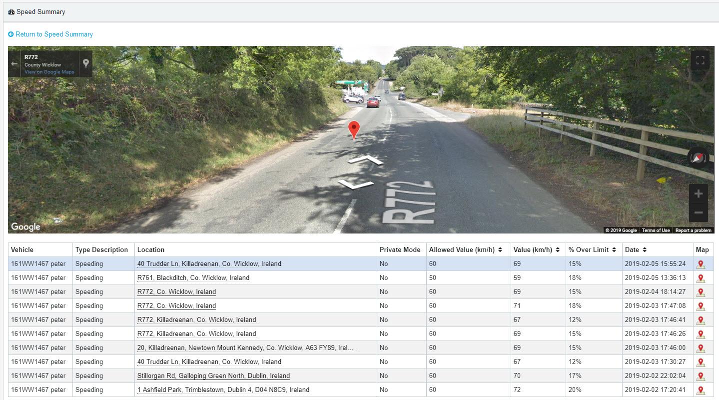
- View all of a vehicle’s speeding events
- To see details of each speeding event and their locations on the map, click on the Vehicle name or the Total value in the table; for example, clicking on Peter or 4.49% will show all speeding events for that vehicle/driver.
The map shows a bouncing red pin to denote the location of the first speeding event.
- To see other locations, either click on the address or the map icon at the end of the row.
- Use the Google map controls to zoom into the map or Street View if required.
The information in the table covers the following for each speeding event during the selected period:
- Vehicle: Vehicle/driver
- Type Description: Speeding
- Location: Address of speeding event
- Private Mode: Reads Yes only if private mode has been activated by the driver
- Allowed Value: Speed limit of road in km/h (or mph in UK)
- Value: Actual speed recorded in km/h (or mph in UK)
- % Over Limit: Percentage recorded speed is over speed limit of road
- Date: Date & time stamp of speeding event by GPS tracker
- Map: Click to view speeding event on map
The columns with black up/down arrows in the headers can be sorted into ascending or descending order.
- Click the arrow once to sort into descending order (largest value first); click again to re-sort into ascending order (smallest value first).
- To return to the main Summary report, click on the Return to Speed Summary link above the map.