What is the Dashboard?
The Dashboard will allow you to create KPIs which can be used for internal management reporting. The Dashboard also allows you to view the activity of your fleet at a glance. Each time you login to your Transpoco account we suggest you open Dashboard to view the stare and progress of your fleet.
The dashboard is unique to each user, the user can create metrics which are relevant to their role.
How to create a metric in the Dashboard
In this video we will demonstrate how to create a metric in the Dashboard.
Please click here for a more detailed explanation of creating a metric.
Please click here to view a list of all the available KPI metrics and how to create each metric.
What information does a metric contain?
Some metrics display data in graphs and some metrics display data as a percentage - see the 2 examples below.
Each metric specifies the time period and the vehicle group selected.
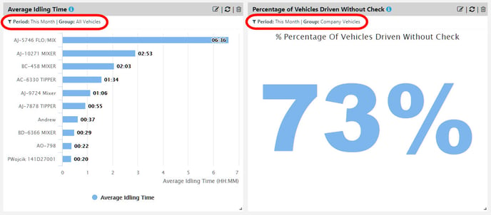
To see an explanation of a metric, hover the cursor over the blue information icon next to the name on the header.
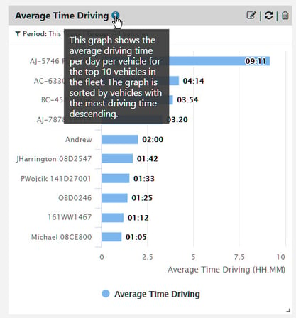
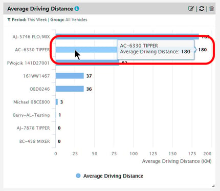
To see information at a glance, hover over, or click on, a bar in the graph.
How to change the shape and position of a metric in the Dashboard
In the video below we demonstrate how you can change the size of a metric and reposition a metric in the Dashboard.
Move your cursor over the bottom right corner of the metric, hold down the left button on your mouse and drag the metric as demonstrated in the video.
Using your Dashboard to show the progress of KPIs
In this video we have provided a suggestion for arranging the layout of your Dashboard to allow you to measure progress of each KPI you create.
For customers with the Perform package I suggest you focus on these key metrics for comparison:
-Percentage of vehicles Driven with Check
-Average Fuel Consumption
-Total Idling Time
-Driving Summary Score
-Percentage of journeys driver ID used (for customers using driver ID)
Follow these steps to arrange your Dashboard:
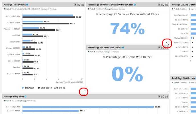
1. Create 2 metrics side by side in the Dashboard for each KPI. Use one of the KPIs mentioned above.
2. Configure the left metric to represent the benchmark using a customised time period (for example 01/08/2021 - 31/08/2021).
3. Configure the right metric with the time period 'This Month'. When you select 'This Month' the month will change automatically, for example at the end of September the metric will display data for October.
This approach will allow you to measure the present state of your fleet against the benchmark time period; hopefully utilising the full potential of Transpoco will help you to improve in every metric.
Instead of comparing individual vehicles, we suggest you can compare vehicle groups in these metrics. To learn more about creating vehicle groups click here
Vehicle groups can be created to represent company departments, branches of the company, regional divisions, vehicles assigned to a supervisors etc.
In the configuration of the metric select the Split by Group option and select the vehicle groups from the list of vehicle groups you have created.
You can now compare the performance of vehicle groups
Useful tips to help you to use the Dashboard
In this video we demonstrate some useful tips and suggestions to use the full potential of the Dashboard.
Please click here to view more helpful articles on the Dashboard.